<input> elements of type radio are generally used in radio groups—collections of radio buttons describing a set of related options. Only one radio button in a given group can be selected at the same time. Radio buttons are typically rendered as small circles, which are filled or highlighted when selected.
Example
Usage:
Go to Components → Contact Enhanced → Form Fields, click on the New button, then set the Form Field Type to Radiobox.
Edit Custom Field Value by adding a new row for each new option. The first option is the field's value and the second is the label.
Tip:
Start the value with -- (two dashes) in order to create group field.
You can add any HTML to the field's label Text, for example:
- An Image:
<img src='https://idealextensions.com/images/ideal-logo.png' alt='image placeholder text' /> - A text with a link:
Accept <a href=https://idealextensions.com/pre-sales/terms-and-conditions.html target=_blank >Terms and Conditions</a>
Tip: if adding image, you might need to add a CSS Form Field with the following content:
img{border:0;height:auto;max-width:100%} 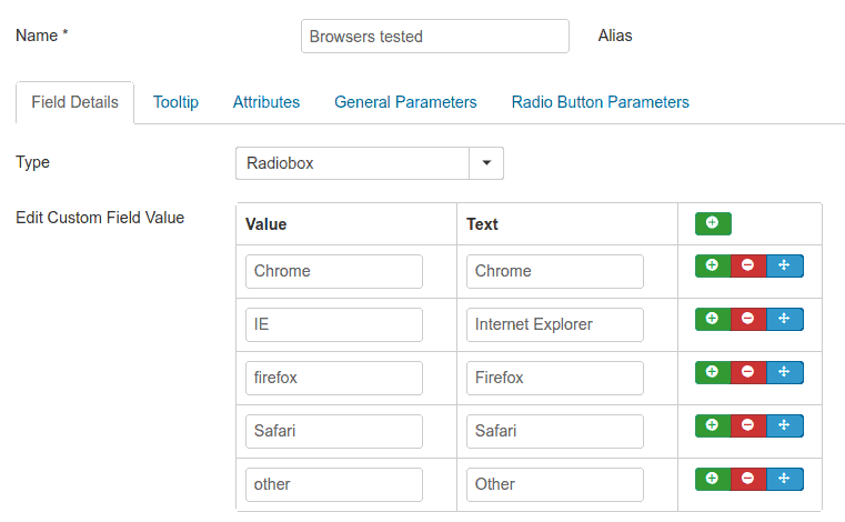
Select List Parameters
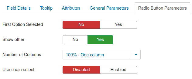
- First Option Selected:
- Displays the first option already selected on page load and allows the user to change.
- Show "other":
- When enabled it displays a text field when the last option is selected
- Number of columns
- Displays the radio buttons in columns with equal width
 Recommend to a friend