Contact Enhanced Documentation
- Details
- Category: Form Fields
{gdata id=|F-fERcoMN2U|}
Description
Form Fields allows you to extend the functionality of Contact Enhanced.
Requirement
- Have created one or more Contact Enhanced categories;
important Information
- You can add as many Form Fields as you'd like;
- The Name, Email, Subject and Recipient Form Field types have special behaviors;
- Every Form MUST have the Name and Email Form Field types; If you don't want to display them, then set the value and hide them;
- Read more information regarding the Form Fields in the Documentation Page.
Usage
Select Components → Contact Enhanced → Form Fields from the drop-down menu of the Joomla! Administrator Panel.
To add a new Form Field, press the "New" icon in the toolbar. To edit an existing Form Field, click on the Form Field's Name OR click the Form Field's checkbox and then click on the "Edit" icon in the toolbar.
Screenshot
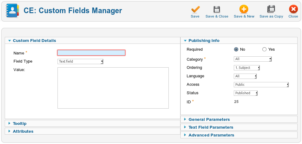
Details and Options/Parameters
- Name: The full name of the Custom Field. This will be displayed as the Custom Field label in the form;
- Field type:Each Custom Field Type has a special rendering option and different parameters that are only loaded after you press the Save button in the Toolbar. A short description of each custom field follows:
- Text: Displays an input[type=text] box. It has several validation options under he Text Field Parameters, such as: Alpha (letters a-Z), Alphanumeric, Date, Digits, Integer, Numeric, URL, Email and Custom Validator, which allows to customize the validator;
- AutoComplete: For Advanced users: AutoCompleter is a custom field which uses MooTools to provide the functionality for text suggestion and completion. You will need to provide a SQL query in order to allow the user to search the database using this Custom Field.
- Button: For Advanced users: Allows you to add a button to the form to perform a specific action using Javascript in the Attributes box (see Attributes below);
- Checkbox: Let a user select ONE or MORE options of a limited number of choices; More information;
- Date: Let a user to select a date using a javascript calendar; More information;
- Date Range: Displays two date custom fields side by side, so the user can select the "from" and "to" dates; More information;
- FreeText: Allows you to add any text or HTML to the Value box in order to be displayed in the form; More information;
- Hidden input: For Advanced users: Allows you to add a hidden value; Advanced users usually use with Javascript in order to store a value; More information;
- Multiple Files: Allow users to upload any file type or size using the form. File type and size can be restricted in the Multiple Files Parameters. If you have configured Contact Enhanced to save the messages in the Component Configuration, it will save the files in [path to Joomla]/administrator/components/com_contactenhanced/uploadedfiles/ and also send as attachments, otherwise it will only send the files as attachments. If all files together are larger than 2Mb, then CE will save the file and only send a link to the files by email. This is because some mail servers do not allow messages larger than 2Mb.
- MultiText (textarea): Displays a multi-line text input element. In a textarea the user can write an unlimited number of characters. The Maximum Length can be configured in the Parameters; More information;
- Number: Displays a select list with the number range added to the Value box, such as 1-10; More information;
- Number Range: Displays two Number select lists with the number range added to the Value box, such as 1-10|11-20; More information;
- Form Pagination: Allows you to display your form in several pages/steps; More information;
- Radiobox: let a user select ONLY ONE of a limited number of choices; More information;
- Select List: Creates a drop-down list based on the options separated by | (pipe) in the Value box; More information;
- SQL: Creates a drop-down list based on the result of a SQL query; With this field you can also create Chain Selects;
- WYSIWYG (content editor): Displays an editor, so your users will be able to add rich text (HTML);
- ONLY ONE PER CATEGORY:Some Custom fields are only allowed one per each category:
- Name: Creates a input[type=text] for the user's name; It will retrieve the user's name from database if the user is logged in;
- Surname: Same as last name;
- Email: Creates a input[type=text] for the user's email address; It will retrieve the user's email from database if the user is logged in;
- Subject: By default it creates a input[type=text] for the subject, however you can enter elements separated by | (pipe) in the Value Box and it will create a select list instead; More information;
- Select Recipient (to): Creates a select list (drop down list) with the pair email::Name added to the Value box or create select list with emails from contacts in the same category; More information;
- Username: To be used if the form is used as a registration form. This field can use Ajax to check if the username is available;
Contact Enhanced was not designed to be a User manager, however per some customers request we've implemented a registration form; - Password: Creates a input[type=password] which allows users to require a password in the registration form;
- NEWSLETTERS:Contact Enhanced has integration with some newsletters services/components, so the user can be subscribed to one or more newsletter lists when the form is submitted:
- AcyMailing: AcyMailing is a Joomla component; More information;
- Campaign Monitor: More information;
- MailChimp: More information;
- Other integrations:
- GMaps: This custom field allows your users to find an address on the map. Do not confuse this with the Contact's map;
- Insert Code in Source:
- CSS: Inserts CSS code into the page, inside the <head> tag; More information;
- Javascript: Inserts Javascript code into the page, inside the <head> tag; More information;
- PHP: Inserts PHP code into the page, wherever position the Custom Field is displayed; More information;
- Value: Some Custom Field types allow you to add a pre-defined value;
- Tooltips: The tooltip text to display; By default CE displays the tooltip onMouseOver the Field's label, however you can change this behavior under the General Parameters;
- Attributes: Allows you to add attributes to the field. Common attributes are style and Javascript behaviors like onclick, onblur, onmouseover,..;
Publishing Info
- Required: Whether the field should be mandatory or not;
- Category: The category this field will be assigned to. A Custom Field can be assigned to either one specific category OR to all categories. This allows you to have different forms. In order to have different forms you have to create a different category for each form and assign a contact and Custom Fields to that new category;
- Ordering: Field Ordering; The order in which to display Custom Fields. In the Custom Fields Manager, if the list is sorted by this column, you can change the order by clicking the arrows or by entering the sequential order and clicking the 'Save Order' icon.
- Language: The Custom Field language;
- Access: Who can view this Custom Field;
- Status:State of the Custom Field. Possible values are:
- Published: The item is published. This is the only state that will allow regular website users to view this item;
- Unpublished: The item is unpublished;
- Trashed: The item has been sent to the Trash;
General Parameters / Options:
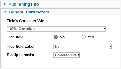
- Field's Container Width: Allows you to display the Custom Fields in multiple columns, by changing the Custom Field's container width; The label and field of a Custom Field are inside a <div> tag which is called "container" here. Keep in mind that Custom Field order will be from left to right -> top to bottom.
- Hide Field: Whether to display the field or not;
- Hide field Label: Whether to Hide the field's label or not;
- Tooltip Behavior:How to display the Tooltip:
- OnMouseOver: Will only display the Tooltip when the mouse hovers the Field label;
- Image Icon: Displays an image icon after the field's label and the tooltip will be displayed and the mouse hovers the icon;
- Inline: Will display the tooltip right below the Field's label;
 Recommend to a friend
 Copyright © 2018 IdealExtensions.com. All Rights Reserved.
This site is not affiliated with or endorsed by the Joomla!™ Project. It is not supported or warranted by the Joomla!™ Project or Open Source Matters™. The Joomla!™ logo is used under a limited license granted by Open Source Matters™, the trademark holder in the United States and other countries.
We may collect your IP address and your browser's User Agent string while using our site for security reasons and deriving aggregate information (analytics). This information is retained for a minimum of 1 and a maximum of 24 months.
We may collect your IP address and your browser's User Agent string while using our site for security reasons and deriving aggregate information (analytics). This information is retained for a minimum of 1 and a maximum of 24 months.