 Recommend to a friend
| Before installation: Joomla comes with a core program for contacts. You must first set up users. To do this, go to the "Control Panel". Select "User Manager". Now, add the users you will need for your contact form(s). | |
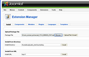 | Log in to Joomla's Administrative area. Select "Extentions" Select "Browse Files" Select the package file you have just received by email. Select "Upload and Install." |
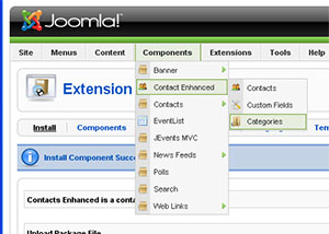 | Once the program is installed, choose "Components" Scroll to "Contact Enhanced" You must first set up categories. Choose "Categories" When the category screen appears, in the upper right corner, choose "New".
|
For the "Title", type in "Sales Department". Save the category.
Again, select "New" and for the "Title", type in "Support". Save the category. | |
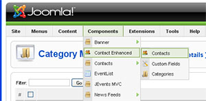 | You now need to set up your contacts. Go to Components > Contact Enhanced > Contacts Select "New" In the "Name" field, type in: Pre-sales Questions In the "Category" field, select Sales Department. In the "Linked to User" field, choose your preferred contact person. |
Contact Enhanced
Event Properties
- x -Mouse x coordinate when the event happened.
- y -Mouse y coordinate when the event happened.
JavaScript defines five types of events which are form, image, image map, link, and window events. Events are associated with HTML tags. The definitions of the events described below are as follows:
Form Events
- blur - The input focus was lost.
- change - An element lost the focus since it was changed.
- focus - The input focus was obtained.
- reset - The user reset the object, usually a form.
- select - Some text is selected
- submit - The user submitted an object, usually a form.
Image Events
- abort - A user action caused an abort.
- error - An error occurred.
- load - The object was loaded.
Image Map Events
- mouseOut - The mouse is moved from on top a link.
- mouseOver - The mouse is moved over a link.
Link Events
- click - An object was clicked.
- mouseOut - The mouse is moved from on top a link.
- mouseOver - The mouse is moved over a link.
Window Events
- blur - The input focus was lost.
- error - An error occurred.
- focus - The input focus was obtained.
- load - The object was loaded.
- unload - The object was exited.
Event Association
Events are associated with HTML tags. The definitions of the events described below are as follows:
- abort - A user action caused an abort of an image or document load.
- blur - A frame set, document, or form object such as a text field loses the focus for input.
- click - Happens when a link or image map is clicked on
- change - Happens when a form field is changed by the user and it loses the focus.
- error - An error happened loading a image or document.
- focus - A frame set, document, or form object such as a text field gets the focus for input.
- load - The event happens when an image or HTML page has completed the load process in the browser.
- mouseOut - The event happens when the mouse is moved from on top of a link or image map
- mouseOver - The event happens when the mouse is placed on a link or image map.
- reset - The user reset the object which is usually a form.
- submit - The user submitted an object which is usually a form.
- unload - The object such as a framesed or HTML document was exited by the user.
The events for each HTML tag are as follows:
- <A>
- click (onClick)
- mouseOver (onMouseOver)
- mouseOut (onMouseOut)
- <AREA>
- mouseOver (onMouseOver)
- mouseOut (onMouseOut)
- <BODY>
- blur (onBlur)
- error (onError)
- focus (onFocus)
- load (onLoad)
- unload (onUnload)
- <FORM>
- submit (onSubmit)
- reset (onReset
- <FRAME>
- blur (onBlur)
- focus (onFocus)
- <FRAMESET>
- blur (onBlur)
- error (onError)
- focus (onFocus)
- load (onLoad)
- unload (onUnload)
- <IMG>
- abort (onAbort)
- error (onError)
- load (onLoad)
- <INPUT TYPE = "button">
- click (onClick)
- <INPUT TYPE = "checkbox">
- click (onClick)
- <INPUT TYPE = "reset">
- click (onClick)
- <INPUT TYPE = "submit">
- click (onClick)
- <INPUT TYPE = "text">
- blur (onBlur)
- focus (onFocus)
- change (onChange)
- select (onSelect)
- <SELECT>
- blur (onBlur)
- focus (onFocus)
- change (onChange)
- <TEXTAREA>
- blur (onBlur)
- focus (onFocus)
- change (onChange)
- select (onSelect)
Event Handlers
Event handlers are created as follows:
onEvent = "Code to handle the event"
The following example demonstrates its use:
<a href="/independent/index.html" target="_top" onMouseOver="window.status='To Independent Technologies Section' ;return true" onMouseOut="window.status='';return true"><img SRC="gifs/greenindependentbutton2.gif" ALT="Independent Technologies" VSPACE=3 BORDER=0 height=35 width=120></a><BR>
As you can see, the event handling attribute is included in the HTML tag. When multiple statements are included in the event handling code, the statements are separated by a semicolon.
The following example can be used to redirect a link to another location:
<HTML>
<HEAD>
<TITLE>Using functions as event handlers</TITLE>
<SCRIPT LANGUAGE="JavaScript">
<!--
function nameDefined(ckie,nme)
{
   var splitValues
   var i
   for (i=0;i<ckie.length;++i)
   {
      splitValues=ckie[i].split("=")
      if (splitValues[0]==nme) return true
   }
   return false
}
function delBlanks(strng)
{
   var result=""
   var i
   var chrn
   for (i=0;i<strng.length;++i) {
      chrn=strng.charAt(i)
      if (chrn!=" ") result += chrn
   }
   return result
}
function getCookieValue(ckie,nme)
{
   var splitValues
   var i
   for(i=0;i<ckie.length;++i) {
      splitValues=ckie[i].split("=")
      if(splitValues[0]==nme) return splitValues[1]
   }
   return ""
}
function testCookie(cname, cvalue) {  //Tests to see if the cookie
   var cookie=document.cookie        //with the name and value
   var chkdCookie=delBlanks(cookie)  //are on the client computer
   var nvpair=chkdCookie.split(";")
   if(nameDefined(nvpair,cname))  //See if the name is in any pair
   {
      tvalue=getCookieValue(nvpair,cname)  //Gets the value of the cookie
      if (tvalue == cvalue) return true
	   else return false
   }
   else return false
}
function redirectLink() {
   if (testCookie("javahere", "yes")) {
      window.location="javahere.html"
   }
   else{
      var futdate = new Date()
      var expdate = futdate.getTime()
      expdate += 3600*1000  //expires in 1 hour(milliseconds)
      futdate.setTime(expdate)
      var newCookie="javahere=yes; path=/;"
      newCookie += " expires=" + futdate.toGMTString()
      window.document.cookie=newCookie
      window.location="javanot.html"
   }
}
//-->
</SCRIPT>
</HEAD>
<BODY>
<H3>Using an event handler to direct a link based on a cookie value</H3>
<P>
<A NAME="Here" onClick="return redirectLink()">See if you've been here.</A>
</P>
</BODY>
</HTML>
Feedback
These guidelines are intended as a work-in-progress and will continue to be informed by feedback from users and staff members. Ideas about and suggestions for improvement of the document can be forwarded using our forum and email form. If you made a screencast or a tutorial, you can post on the forum or send it to us by email.
How to get the this Joomla Extension
With our automated payment and delivery process, you could be downloading and installing your new component in a few minutes! We use PayPal as our payment processor. It is one of the most preferred payment methods on the internet. You are not obligated to sign up with PayPal, so you can also just make a onetime purchase using your favorite creditcard.
{tab=Screencasts}All Screencasts on available on this page were produced by Dale, the nicest Canadian lady I've ever "met". Thanks Dale!
Installation Instructions
Screencast by Dale
Editing HTML Templates
Contact Enhanced Plugin
Screencast by Dale
Setting up Google Maps + Security
Screencast by Dale
{tab=Contact Enhanced}Contact Enhanced Manager
How to access
Select Components → Contact Enhanced → Contacts from the drop-down menu on the back-end of your Joomla! installation.
Description
The Contact Enhanced Manager screen allows you to add contact information to your Joomla! site. You can enter information such as name, address, phone and e-mail. You can also link contacts to registered users. Afterwards, you can use the Menu Manager to create front-end links to the the contacts.
Screenshot

Column Headers
Click on the column heading to sort the list by that column's value.
#. An indexing number automatically assigned by Contact Enhanced for ease of reference.
Checkbox. Check this box to select one or more items. To select all items, check the box in the column heading. After one or more boxes are checked, click a toolbar button to take an action on the selected item or items. Many toolbar actions, such as Publish and Unpublish, can work with multiple items. Others, such as Edit, only work on one item at a time. If multiple items are checked and you press Edit, the first item will be opened for editing.
Name. The name of the Contact. You can click on the Name to open the Contact for editing.
Published. Whether the item has been published or not. You can change the Published state by clicking on the icon in this column.
Order. The order to display items. If the list is sorted by this column, you can change the order by clicking the arrows or by entering the sequential order and clicking 'Save Order'. Note that the display order on a page is set in the Parameters - Advanced section for each Menu Item. If that order is set to use something other than 'Order' (for example, 'Title - Alphabetical'), then the order value in this screen will be ignored. If the Menu Item Order parameter is set to use 'Order', then the items will display on the page based on the order in this screen.
Access Level. Who has access to this item. Current options are:
Public: Everyone has access
Registered: Only registered users have access
Special: Only users with author status or higher have access
Category. The Category that this Contact belongs to. Clicking on the Category Title opens the Category for editing. Note that Contact Categories are separate from other Categories, such as those for Articles, Banners, Newsfeeds, and Web Links.
Linked to User. The username this contact is linked to (if applicable).
ID. The ID number. This is a unique identification number for this item assigned automatically by Contact Enhanced. It is used to identify the item internally. You can not change this number.
Display #. The number of items to display on one page. If there are more items than this number, you can use the page navigation buttons (Start, Prev, Next, End, and page numbers) to navigate between pages. Note that if you have a large number of items, it may be helpful to use the Filter options, located above the column headings, to limit which items display.
Toolbar
At the top right you will see the toolbar:

The functions are:
Publish. To publish one or more items, select them and click on this button.
Unpublish. To unpublish one or more items, select them and click on this button.
Delete. To delete one or more items, select them and click this button. The selected items will be deleted.
Edit. Select one item and click on this button to open it in edit mode. If you have more than one item selected, the first item will be opened. You can also open an item for editing by clicking on its Title or Name.
New. Click on this button to create a new item. You will enter the New page for this item.
Parameters. See Global Configuration section below.
Help. Opens this Help Screen.
Global Configuration
Click the Parameters button to open the Contact Enhanced Global Configuration window. This window allows you to set default parameters for Contact Enhanced, as shown below.

Save. Press Save to save your settings.
Cancel. Press Cancel to cancel your changes.
- Captcha. Press Disable to disable Captcha in all forms
- Thank you message. What message to show after the form is submitted. Select an option from the list:
- Joomla Default: Displays a "Thank you message" right above the form;
- Show sent email message: Shows to the user the email that was just sent;
- Javascript Alert: Shows a Thank you message in a Javascript Alert style;
- Custom Redirect:The page is going to be redirected to the URL listed in the Custom Redirect option.
- Custom Redirect: Redirect after submit email. Place an external URL starting with http or an internal URL starting with index.php;
- Show User Info: Show User Info on email. User info = IP, Operating System, Screen size and Web Browser;
- Max File Size: Max File size (in Kb) for attachments files;
Icons/Text. Whether an Icon, Text or nothing is displayed next to the Contact fields.
Address Icon. Icon to use for Address. Select an image file in the drop-down list box. These images are located in the 'images/M_images' folder.
E-mail Icon. (Hide/Show/Use Global) Whether or not to display a button to allow a link to the Article to be e-mailed. This displays a form that allows the user to send an e-mail with a link to the current Article.
Telephone Icon. Icon to use for Telephone. Select an image file in the drop-down list box. These images are located in the 'images/M_images' folder.
Mobile Icon. Icon to use for Mobile phone. Select an image file in the drop-down list box. These images are located in the 'images/M_images' folder.
Fax Icon. Icon to use for Fax. Select an image file in the drop-down list box. These images are located in the 'images/M_images' folder.
Miscellaneous Icon. Icon to use for Miscellaneous. Select an image file in the drop-down list box. These images are located in the 'images/M_images' folder.
Show Table Headings. Hide or Show the column headings (Name, Address, and so on) in the Contact Category Layout.
Show Contact Position. Hide or Show the Contact's Position.
Show E-mail Address. Hide or Show the Contact's E-mail address.
Show Telephone Number. Hide or Show the Contact's Telephone number.
Show Mobile Number. Hide or Show the Contact's Mobile phone number.
Show Fax Number. Hide or Show the Contact's Fax number.
Enable vCard. Whether or not to enable vCard support for Contacts. vCard is a special file format for electronic business cards. This allows contact information to be sent in a standard way via e-mail. Note that this parameter must be set to "Yes" for the vCard feature to work. If this parameter is "No" and vCard is set to "Show" for a Contact, the vCard link will show but the link will not work correctly. It will only show a blank screen.
Banned E-mail. Enter any e-mails to be banned from the site. E-mail addresses containing any of the listed text will be banned. Separate different words with semi-colons ';'. For example, the entry "spam;junk" would ban e-mail addresses such as "myspam@.com" or "aeddie@junkisgood.com".
Banned Subject. Enter any e-mail subject words to be banned from the site. Separate different words with semi-colons ';'. For example, the entry "spam;junk" would ban e-mail subjects such as "This is not spam" or "I Like Junk".
Banned Text. Enter any e-mail text words to be banned from the site. Separate different words with semi-colons ';'. For example, the entry "spam;junk" would ban e-mail content such as "This is not spam" or "I Like Junk".
Session Check. Whether or not to check for the existence of a Session Cookie on the User's computer. If set to 'Yes', Users without Cookies enabled will not be able to send e-mails.
Custom Reply. Whether or not to use the Custom Reply. Setting this to 'No' allows integration to other systems.
List Filters
Filter by Partial Title
You can filter the list of items by typing in part of the Title or the ID number. You can also select a combination of Category and Published State.
Filter. In the upper left corner just above the column headings is a Filter field and two buttons, as shown below:

If you have a large number of items on the list, you can use this filter to find the desired item(s) quickly.
Filter by Category and Published State
In the upper right area, above the column headings, are 2 drop-down list boxes as shown below:
The selections may be combined. Only items matching both selections will display in the list.
Select Category. Use the drop-down list box to select the desired Category. Only items in this Category will display.
Select State. Use the drop-down list box to select the published state: Published or Unpublished.
Quick Tips
You need to add at least one Category for your Contact Enhanced before you can add your first Contact. Categories are added using the Contact Enhanced Category Manager.
For most screenshots I've used Firefox and Ubuntu Studio so it might look a little different.
{tab=Contact Edit}
Contact Enhanced Edit or Add New
How to Access
Navigate to the Contact Enhanced Manager. To add a new Contact, press the "New" icon in the toolbar. To edit an existing Contact, click on the Contact's Name or click the Contact's checkbox and then click on the "Edit" icon in the toolbar.
Description
This is where you can add a Contact or edit an existing Contact. Contact Enhanced allow you to list people on your web site. They also allow users to send e-mails to those people.
Screenshot

Details and Parameters
In this section, you can enter information about the Contact, such as name, address, e-mail, and so on. The Parameters allow you to control what information gets displayed for each Contact.
Details
Name. The full name of the Contact.
Alias. The internal name of the item. Normally, you can leave this blank and Joomla! will fill in a default value. The default value is the Title or Name in lower case and with dashes instead of spaces. You may enter the Alias manually. The Alias should consist of lowercase letters, and no blank spaces are allowed. Use a hyphen (-) instead. The Alias will be used in the URL when SEF is activated.
Published. Whether or not Users can view this Contact's information
Category. Select the Category for this Contact from the drop-down list box. Note that you must have at least one Contact Category defined before you can add a Contact.
Linked to User. Select the User, if any, that this Contact is linked to from the drop-down list box. This allows you to link this Contact's information to a registered Joomla! User. If this Contact is not linked to a User, select "-No User-".
Order. Indicates the order of this Contact in the Contact Manager. The default Order is to add the item to the end of the list. This Contact will move to the position just after the Contact selected from the drop-down list. Note that the Order of Contacts can also be changed in the Contact Manager.
Access Level. Who has access to this item. Current options are:
Public: Everyone has access
Registered: Only registered users have access
Special: Only users with author status or higher have access
ID. The ID number. This is a unique identification number for this item assigned automatically by Joomla!. It is used to identify the item internally, for example in internal links. You can not change this number.
Information
Contact's Position: The Contact's current position.
E-mail. The Contact's e-mail address. Note that e-mail addresses in Joomla! can be protected from "spambots" by enabling "Content-Email Cloaking" in the Plugin Manager. This is enabled by default.
Street Address. The Contact's street address.
Town/Suburb. The Contact's town or suburb.
State/County. The Contact's state or county.
Postal Code/ZIP. The Contact's postal code.
Country. The Contact's country.
Telephone. The Contact's phone number.
Mobile Phone Number: The Contact's mobile phone number.
Fax. The Contact's fax number.
Web URL. The Contact's web site address.
Miscellaneous Information. Other information about this Contact. HTML is allowed in this field.
SideBar. Any information about this Contact or the form or anything you would like. HTML is allowed in this field.
Contact Image. Image to display for this Contact. Select an image file from the drop-down list box. This lists images in the 'images/stories' folder. Images can be uploaded using the Media Manager.
Contact Parameters
Name. Hide or Show the Contact's Name.
Contact's Position. Hide or Show the Contact's Position.
E-mail. Hide or Show the Contact's e-mail address.
Street Address. Hide or Show the Contact's street address.
Town/Suburb. Hide or Show the Contact's town or suburb.
State/County. Hide or Show the Contact's state or county.
Postal/Zip Code. Hide or Show the Contact's postal code.
Country. Hide or Show the Contact's country.
Telephone. Hide or Show the Contact's telephone number.
Mobile Phone Number. Hide or Show the Contact's mobile phone number.
Fax. Hide or Show the Contact's fax number.
Web URL. Hide or Show the Contact's web site URL.
Miscellaneous Information. Hide or Show any miscellaneous information entered for this Contact.
Contact Image. Hide or Show the Contact's image.
vCard. Hide or Show the vCard link for this Contact. Note that the "Enable vCard" parameter in the Contact Enhanced Manager - Parameters must be set to "Yes" for this option to work correctly. Otherwise, pressing the vCard link will just show a blank screen.
Advanced Parameters
Clicking on the "Advanced Parameters" heading displays the Advanced Parameters screen, as shown below:
- Show SideBar:Choose whether you want to show the sidebar at the right, left or if you want to show it at all;
- Sidebar width: Select the width percentage for the Sidebar column; It is a percentage of the whole width;
Icons/Text. Whether to display an Icon, Text or nothing next to the Contact fields.
Address Icon. Icon to use for Address. Select an image file in the drop-down list box. These images are located in the 'images/M_images' folder.
E-mail Icon. (Hide/Show/Use Global) Whether or not to display a button to allow a link to the Article to be e-mailed. This displays a form that allows the user to send an e-mail with a link to the current Article.
Telephone Icon. Icon to use for Telephone. Select an image file in the drop-down list box. These images are located in the 'images/M_images' folder.
Mobile Icon. Icon to use for Mobile phone. Select an image file in the drop-down list box. These images are located in the 'images/M_images' folder.
Fax Icon. Icon to use for Fax. Select an image file in the drop-down list box. These images are located in the 'images/M_images' folder.
Miscellaneous Icon. Icon to use for Miscellaneous. Select an image file in the drop-down list box. These images are located in the 'images/M_images' folder.
E-mail Parameters
Clicking on the "Advanced Parameters" heading displays the E-mail Parameters screen, as shown below:

E-mail Form. Hide or Show the E-mail form. If Show is selected, a form is displayed that allows the user to send an e-mail to the Contact from the web site.
Description Text. Optional description text for the E-mail form. E-mail copy. Hide or Show the checkbox: 'E-mail a copy of this message to your own address.'
Banned E-mail. Enter any e-mails to be banned from the site. E-mail addresses containing any of the listed text will be banned. Separate different words with semi-colons ';'. For example, the entry "spam;junk" would ban e-mail addresses such as "myspam@.com" or "aeddie@junkisgood.com".
Banned Subject. Enter any e-mail subject words to be banned from the site. Separate different words with semi-colons ';'. For example, the entry "spam;junk" would ban e-mail subjects such as "This is not spam" or "I Like Junk".
Banned Text. Enter any e-mail text words to be banned from the site. Separate different words with semi-colons ';'. For example, the entry "spam;junk" would ban e-mail content such as "This is not spam" or "I Like Junk".
Toolbar
At the top right you will see the toolbar:

The functions are:
Save. Save it and return to the main screen of the Manager.
Apply. Save it, but stay in the same screen. If you have been working on a screen for a long time and don't want to risk losing your work, pressing Apply saves your work and lets you continue working. If, for example, you lost your Internet connection, your work will be saved up this point.
Close. Return to the previous screen without saving your work. If you press Close while adding a new item, this new item will not be created. If you were modifying an existing item, the modifications will not be saved.
Help. Opens this Help Screen.
Points to Watch
At least one Contact Enhanced Category must be added before adding the first Contact.
{tab=Custom Fields}
Custom Fields Manager
How to access
Select Components → Contact Enhanced → Custom Fields from the drop-down menu on the back-end of your Joomla! installation.
Description
Contact Enhaced has the ability to allow you (site administrator) to assign custom fields to a contact category. Therefore you have to create a category before you create a custom field. Your users will be able to fill that custom field when they submit the form.
Screenshot

Column Headers
Click on the column heading to sort the list by that column's value.
#. An indexing number automatically assigned by Contact Enhanced for ease of reference.
Checkbox. Check this box to select one or more items. To select all items, check the box in the column heading. After one or more boxes are checked, click a toolbar button to take an action on the selected item or items. Many toolbar actions, such as Publish and Unpublish, can work with multiple items. Others, such as Edit, only work on one item at a time. If multiple items are checked and you press Edit, the first item will be opened for editing.
Name. The name of the Custom Field, which is also the label that will be shown in the form. You can click on the Name to open the Custom field for editing.
- Value. For certain Field Types (Select list, Radio, Checkbox, ) you have to setup the available options separated by pipe | . For example, on our support contact page you have to fill which browsers you have tested, in order to do that we selected the Radiobox field type and typed the following content in the value box: Firefox|Internet Explorer|Opera|Google Chrome|Safari|Other
Published. Whether the item has been published or not. You can change the Published state by clicking on the icon in this column.
- Parameters. This advanced option makes Contact Enhanced even more powerfull! You can add styling and javascript code here.
Order by. The order to display Custom Fields in the form. If the list is sorted by this column, you can change the order by clicking the arrows or by entering the sequential order and clicking 'Save Order'.
Category. The Category that this Custom Field belongs to. Clicking on the Category Title opens the Category for editing. Note that Contact Enhanced Categories are separate from other Categories, such as those for Articles, Banners, Newsfeeds, and Web Links.
- Id. The ID number. This is a unique identification number for this Custom Field assigned automatically by Contact Enhanced. It is used to identify the item internally. You can not change this number.
Toolbar
At the top right you will see the toolbar:

The functions are:
Publish. To publish one or more items, select them and click on this button.
Unpublish. To unpublish one or more items, select them and click on this button.
Delete. To delete one or more items, select them and click this button. The selected items will be deleted.
Edit. Select one item and click on this button to open it in edit mode. If you have more than one item selected, the first item will be opened. You can also open an item for editing by clicking on its Title or Name.
New. Click on this button to create a new item. You will enter the New page for this item.
List Filters
Filter by Partial Name
You can filter the list of items by typing in part of the Name. You can also select a combination of Category and Published State.
Filter. In the upper left corner just above the column headings is a Filter field and two buttons, as shown below:
If you have a large number of items on the list, you can use this filter to find the desired Custom Field(s) quickly.
Filter by Category and Published State
In the upper right area, above the column headings, are 2 drop-down list boxes as shown below:
The selections may be combined. Only items matching both selections will display in the list.
Select Category. Use the drop-down list box to select the desired Category. Only items in this Category will display.
Select State. Use the drop-down list box to select the published state: Published or Unpublished.
Quick Tips
You need to add at least one Category for your Contact Enhanced before you can add your first Custom Field. Categories are added using the Contact Enhanced Category Manager.
{tab=Custom Field Edit}
Custom Field: New /Edit
How to Access
Navigate to the Custom Fields Manager. To add a new Custom Field, press the "New" icon in the toolbar. To edit an existing Custom Field, click on the Custom Field's Name or click the Custom Field's checkbox and then click on the "Edit" icon in the toolbar.
Description
This is where you can add a Custom Field or edit an existing one. Contact Enhanced allows you to list Custom Fields on your web site's contact forms. Contact Enhaced has the ability to allow you (site administrator) to assign custom fields to a contact category. Therefore you have to create a category before you create a custom field. Your users will be able to fill that custom field when they submit the form.
Screenshot

Custom Field Details
Name

Name or Title for the custom field. This is the text that will be shown in the front-end as the field label;
HTML Output: <label for="cf_field_id">Field name</label>
Field Type

All available types:
| Type | Value | Value Example | Output |
|---|---|---|---|
| Text Field | |||
| Checkbox | Values separeted by | | Firefox|Internet Explorer|Opera|Google Chrome|Safari|Other | Browsers Tested |
| Date |  | ||
| Date Range | to | ||
| Free Text | Custom HTML | <i>Any Text</i>, <strong>May</strong> contain <u>most HTML tags</u> | Any Text, May contain most HTML tags |
| Hidden Input | |||
| Multiple Files - Beta | |||
| MultiText | |||
| Number | Range separated by - | 1-10 | |
| Number Range | Range separated by - | 1-10|11-20 | |
| Password | |||
| Radiobox | Values separeted by | | Firefox|Internet Explorer|Opera|Google Chrome|Safari|Other | |
| Recipient | email:: Description | sales@mycompany.com:: Sales Department | support@mycompany.com:: Support Department | |
| SelectList | Values separeted by | | Firefox|Internet Explorer|Opera|Google Chrome|Safari|Other | |
| SQL | SQL Query | SELECT text, value FROM #__contact_enhanced_cv WHERE category = 'MY_CATEGORY_NAME_OR_ID' ORDER BY ordering | 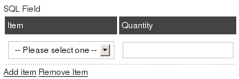 |
| Subject | Blank, Some text or Values separeted by | (if you want to display as a select list) |
Value

For certain Field Types (Select list, Radio, Checkbox, Free Text, Number, Number Range) you have to setup the available options separated by pipe | . For example, on our support contact page you have to fill which browsers you have tested, in order to do that we selected the checkbox field type and typed the following content in the value box: Firefox|Internet Explorer|Opera|Google Chrome|Safari|Other. See table above for more examples.
Tooltip

Add a tooltip to be shown when the mouse is over the field's label (frontend).
- Allows HTML tags
- Max length:250 character
Atributes

This advanced option makes Contact Enhanced even more powerfull! You can add styling and javascript code here. If you are an advanced user you can add, for example, a background-image to any field or a javascript onchange event to a selectlist;
Attibutes dummy examples:
- style="background-color:#F0F0EE;border:1px dashed #9FD377"
- onfocus="this.style.border='3px solid #9FD377'"
- onblur="this.style.border='1px dashed #9FD377'"
- onblur="if(this.value !=''){ alert(this.value);}"
Publishing Info
Published

Whether or not Users can view this Custom Field.
Category

Select the Contact Enhanced Category for this Custom Field from the drop-down list box. Note that you must have at least one Contact Enhanced Category defined before you can add a Custom Field.
Order

Indicates the order of this Custom Field when display on the website . The default Order is to add the item to the end of the list. This Custom Field will move to the position just after the Custom Field selected from the drop-down list. Note that the Order of Custom Field can also be changed in the Custom Field Manager.
Required

Indicates whether the user is required to fill this field in order to submit the form or not. Contact Enhanced uses MooTools1 to validate the forms.
Toolbar
At the top right you will see the toolbar:
The functions are:
-
Save. Save it and return to the main screen of the Manager.
-
Apply. Save it, but stay in the same screen. If you have been working on a screen for a long time and don't want to risk losing your work, pressing Apply saves your work and lets you continue working. If, for example, you lost your Internet connection, your work will be saved up this point.
-
Close. Return to the previous screen without saving your work. If you press Close while adding a new item, this new item will not be created. If you were modifying an existing item, the modifications will not be saved.
-
Help. Opens this Help Screen.
Points to Watch
At least one Contact Enhanced Category must be added before adding the first Custom Field.
1 MooTools is a compact, modular, Object-Oriented JavaScript framework designed for the intermediate to advanced JavaScript developer. It allows you to write powerful, flexible, and cross-browser code with its elegant, well documented, and coherent API. MooTools code respects strict standards and doesn't throw any warnings. It's extensively documented and has meaningful variable names: a joy to browse and a snap to understand. MooTools is compatible and fully tested with Safari 2+, Internet Explorer 6+, Firefox 2+ (and browsers based on gecko), Opera 9+. Mootools is the Joomla default Javascript Library!
{tab=Custom Values}
Custom Values
How to Access
Select Components → Contact Enhanced → Custom Values from the drop-down menu on the back-end of your Joomla! installation.
Description
The Custom Fields Manager screen allows you to create advanced Custom Fields using the SQL custom field type;
Details
Text: The text the user will see in the dropdown select list (required);
- Value: The text that you will get in the email (required);
Type: You can enter any value to help you to keep things organized;
Category: You can use this field as you wish; You can enter a value or select one from the list; IMPORTANT: This is not necessary related to the Contact Enhanced Categories;
SQL Field Examples:
- Nothing fancy:
SELECT text, value FROM #__contact_enhanced_cv WHERE category = 'MY_CATEGORY_NAME_OR_ID' ORDER BY ordering - Same content for the value and text:
SELECT text, text as value FROM #__contact_enhanced_cv WHERE category = 'MY_CATEGORY' AND TYPE='Any type' ORDER BY ordering - If you have a small SQL knowledge you can play around with it. Let's say that you need to show the part number and product name, you your SQL will be like this:
SELECT CONCAT_WS(' :: ',value, text) AS text, value FROM #__contact_enhanced_cv WHERE category = 'MY_CATEGORY_NAME_OR_ID' ORDER BY orderingSELECT CONCAT_WS(' :: ',value, text) AS text, value FROM #__contact_enhanced_cv WHERE category = 'MY_CATEGORY_NAME_OR_ID' ORDER BY ordering - Same content for the value and text:
SELECT text, text as value FROM #__contact_enhanced_cv WHERE category = 'MY_CATEGORY' AND TYPE='Any type' ORDER BY ordering - Get a backend userlist:
SELECT username AS value, name AS text FROM #__users WHERE gid >=23 ORDER BY name ASC - Get data when the user is logged in:
Get user id:
SELECT id AS value, id AS text
FROM #__users
WHERE id = {user_id}
Get user name:
SELECT username AS value, username AS text
FROM #__users
WHERE id = {user_id}
Get Product and order Info from VirtueMart: - SELECT p.product_name AS text,
CONCAT('Product:',p.product_id,' - ', p.product_name,
' :: Order ID:', o.order_id ,
' Date: ', FROM_UNIXTIME(o.cdate),
', Status: ', os.order_status_name) AS value
FROM jos_vm_orders AS o
INNER JOIN jos_vm_order_item AS oi ON o.order_id = oi.order_id
INNER JOIN jos_vm_product AS p ON p.product_id = oi.product_id
INNER JOIN jos_vm_order_status AS os ON o.order_status = os.order_status_code
WHERE o.user_id ={user_id}
{/tabs}
JavaScript Style Attributes
Listed below are the tables of CSS properties for various HTML element style attributes. I have added a column indicating the javaScript name that the browser recognizes for these properties. I have only listed those that I know work, but the trend seems to be to use the same name when one name is the style descriptor. When there are two names, use the first name in lower case and the first character of the second name in upper case. Examples:
- color = color
- background-color = backgroundColor
- font-style = fontStyle
- font-weight = fontWeight
Box Properties
| Name | JavaScript Name | Description | Possible Values | Element Types | Example | inherited |
|---|---|---|---|---|---|---|
| border | Sets border width, style and color. | See border width, style, and color | All | {border: medium solid green} | No | |
| border-bottom | Set the bottom border width style, and color. | See border width, style, and color | All | {border-bottom: medium solid green} | No | |
| border-bottom-width | Set the bottom border width | thin, medium, thick, or length value | All | {border-bottom-width: thin} | No | |
| border-color | Set the border color | A color value, color, #RRGGBB | All | {border: #0000ff} | No | |
| border-left | Set the left border width style, and color. | See border width, style, and color | All | {border-left: medium solid green} | No | |
| border-left-width | Set the left border width | thin, medium, thick, or length value | All | {border-left-width: thin} | No | |
| border-right | Set the right border width style, and color. | See border width, style, and color | All | {border-right: medium solid green} | No | |
| border-right-width | Set the right border width | thin, medium, thick, or length value | All | {border-right-width: thin} | No | |
| border-style | Sets border style | none, dotted, dashed, solid, double, groove, ridge, inset, outset | All | {border: dashed} | No | |
| border-top | Set the top border width style, and color. | See border width, style, and color | All | {border-top: medium solid green} | No | |
| border-top-width | Set the top border width | thin, medium, thick, or length value | All | {border-top-width: thin} | No | |
| border-width | Sets Border width. | thin, medium, thick, or length value | All | {border-width: 8} | No | |
| clear | Determines where floating elements are allowed. | none, left, right, both | All | {clear: left} | No | |
| float | Specifies how text is wrapped and where it is aligned. | none, left, right | All | {float: left} | No | |
| height | Height of element | auto or a height value | Block elements and IMG, INPUT, TEXTAREA, SELECT, and OBJECT | {height: 200} | No | |
| margin | Set element margin width. A single value sets all margins, two values set top and bottom, four values set top, right, bottom, and left margins. | auto, length value, or percent value | All | {margin: 4em 2em 4em 2em} | No | |
| margin-bottom | marginBottom | Set element bottom margin | length value, or percent value | All | {margin-bottom: 4em} | No |
| margin-left | marginLeft | Set element left margin | length value, or percent value | All | {margin-left: 4em} | No |
| margin-right | marginRight | Set element right margin | length value, or percent value | All | {margin-right: 4em} | No |
| margin-top | marginTop | Set element top margin | length value, or percent value | All | {margin-top: 4em} | No |
| padding | Space between border and content. A single value sets all sides, two values set top/bottom and left/right, three values set top, right/left, and bottom, and four values set top, right, bottom, and left. | length value, or percent value | All | {padding: 4em} | No | |
| padding-bottom | Space between bottom border and content. | length value, or percent value | All | {padding-bottom: 4em} | No | |
| padding-left | Space between left border and content. | length value, or percent value | All | {padding-left: 4em} | No | |
| padding-right | Space between right border and content. | length value, or percent value | All | {padding-right: 4em} | No | |
| padding-top | Space between top border and content. | length value, or percent value | All | {padding-top: 4em} | No | |
| width | Width of element | auto or a height value in length or percentage | Block elements and IMG, INPUT, TEXTAREA, SELECT, and OBJECT | {width: 40em} | No |
Background and Color Properties
| Name | JavaScript Name | Description | Possible Values | Element Types | Example | inherited | |
|---|---|---|---|---|---|---|---|
| background | Set background color, repeat, image, attachment, or position. | See background-color, background-image, background-attachment, background-repeat, background-position | All | {background: #8080ff} | No | ||
| background-attachment | Determines if the background image is fixed or scroll. | scroll, fixed | All | {background-attachment: scroll} | No | ||
| background-color | backgroundColor | Sets the background color. | Named or value color | All | {background-color: #8080ff} | No | |
| background-image | Sets the background image. | url | All | {background-image: url('../../../../gifs/flowers.gif')} | No | ||
| background-position | Sets the background image initial position. | top, center, bottom, left, center, right, or percent values | Block and IMG, INPUT, TEXTAREA, SELECT, and OBJECT | {background-position: left top} | No | ||
| background-repeat | Sets how the background image is repeated. | repeat, repeat-x, repeat-y, no-repeat | All | {background-repeat: no-repeat} | No | ||
| color | color | Sets element color. | Named or value color | All | {color: green} | Yes |
Classification Properties
| Name | JavaScript Name | Description | Possible Values | Element Types | Example | inherited |
|---|---|---|---|---|---|---|
| display | Sets the type of element. | block, inline, list-item, none | All | {display: list-item} | No | |
| list-style | listStyle | Sets list style type and/or position. | See list-style-type and list-style-position | List-item | {list-style: circle} | Yes |
| list-style-image | Sets image to be used as the list item marker. | url | List-item | {list-style-image: url(this.gif)} | Yes | |
| list-style-type | Sets list style type. | circle, disc, decimal, lower-alpha, lower-roman, none, square, upper-alpha, upper-roman | List-item | {list-style-type: square} | Yes | |
| list-style-position | Sets where the marker is place relative to the text and its wrapping position. | inside, outside | List-item | {list-style: circle} | Yes | |
| whitespace | Sets treatment of spaces inside the element. | normal, pre, nowrap | Block | {whitespace: pre} | Yes |
Font Properties
| Name | JavaScript Name | Description | Possible Values | Element Types | Example | inherited |
|---|---|---|---|---|---|---|
| font | Used to define font properties | See font-family, font-size, font-style, font-variant, and font-weight. | All | {font: 20pt} | Yes | |
| font-family | fontFamily | Used to define font family to use | family name | All | {font-family: ariel roman} | Yes |
| font-size | Used to define font size to use | xx-small, x-small, small, medium, large, x-large, xx-large, larger, smaller, length value, or percent value | All | {font-size: 18pt} | Yes | |
| font-style | fontStyle | Used to define font style to use | normal, italic, oblique | All | {font-style: italic} | Yes |
| font-variant | fontVariant | Used to determine whether to use normal or small caps | normal, small-caps | All | {font-variant: small-caps} | Yes |
| font-weight | fontWeight | Sets font weight. | normal, bold, bolder, lighter, 100, 200, 300, 400, 500, 600, 700, 800, 900 | All | {font-weight: 600} | Yes |
Text Properties
| Name | JavaScript Name | Description | Possible Values | Element Types | Example | inherited |
|---|---|---|---|---|---|---|
| letter-spacing | Sets the space between characters. | normal or length value | All | {letter-spacing: 0.2em} | Yes | |
| line-height | lineHeight | Sets the height of lines. | normal, a number, a percent of the element font size, | All | {line-height: 2} | Yes |
| text-align | textAlign | Sets the alignment of text. | left, right, center, justify | Block | {text-align: center} | Yes |
| text-decoration | textDecoration | Sets the special decoration attributes of text. | none, overline, underline, line-through, blink | All | {text-decoration: blink} | No |
| text-indent | textIndent | Sets the element's first line amount of indentation. | length or percentage value | Block | {text-indent: 5%} | Yes |
| text-transform | textTransform | Transforms text to one of the set values. | none, capitalize, uppercase, lowercase | All | {text-transform: uppercase} | Yes |
| vertical-align | verticalAlign | Sets vertical position. | baseline, sub. super, top, middle, bottom, text-top, text-bottom, or percent value | Inline | {vertical-align: sub} | No |
| word-spacing | Sets extra space between words. | normal or length value | All | {word-spacing: 0.2em} | Yes |
Copyright © 2018 IdealExtensions.com. All Rights Reserved.
This site is not affiliated with or endorsed by the Joomla!™ Project. It is not supported or warranted by the Joomla!™ Project or Open Source Matters™. The Joomla!™ logo is used under a limited license granted by Open Source Matters™, the trademark holder in the United States and other countries.
We may collect your IP address and your browser's User Agent string while using our site for security reasons and deriving aggregate information (analytics). This information is retained for a minimum of 1 and a maximum of 24 months.
We may collect your IP address and your browser's User Agent string while using our site for security reasons and deriving aggregate information (analytics). This information is retained for a minimum of 1 and a maximum of 24 months.