Contact Enhanced Documentation
Extensions
Here you can find all Joomla Extensions that we have developed.
This very text is a Joomla category description for my Extensions Category.
As you can see you can have a full feature FAQ component using MooFAQ
If you are looking for a way to create and manage your own podcast on your Joomla!™ website, you might want to check out Ideal Podcasts. It's a set of extensions that allows the site admins to create, manage, and host a podcast feed directly from their website. Ideal Podcasts is designed to make podcasting easy and fun for anyone, whether you are a beginner or a seasoned podcaster. Ideal Podcasts is the best way to share your voice with the world. Try it today and see for yourself! It is a simple and powerful way to create, publish and distribute your podcast. Ideal Podcasts is a web-based platform that lets you manage all of the aspects related to your podcast, from the upload of episodes to its submission to all major directories such as Apple Podcasts, Google Podcasts, Amazon Music, Spotify, Stitcher, TuneIn, iHeartRadio, and more, so you can reach a wider audience and grow your listenership. With Ideal Podcasts, you can focus on creating great content and leave the rest to the app. It's the ultimate Podcast software for Joomla!™.
Contact Enhanced is a contact component manager created to replace Joomla! core contacts component and add lots of advantages and new features (see Features tab below) and it offers many plugins and modules for several different purposes. When you check out you can choose 3 different subscriptions: 6 Months, 1 year or 5 years
Features
{loadposition ce-features}Demonstration Pages
- Contact Enhanced Demo site
- Live forms:
Form Fields Available
See the Form Field Documentation for Form Field details and usage instructions.
- Text Field
- CheckBox
- Date
- Date range
- Free text
- Hidden input
- Multi-text (textarea)
- Multiple File Upload
- Number
- Number Range Password
- Radio Button
- Select List
- SQL (get data from your database)
- Multiple SQL;
- Campaign Monitor (newsletter integration);
- AcyMailing Newsletter Integration;
- MailChimp Newsletter Integration;
- Advanced Form Fields
- Javascript (add js code to the page);
- CSS (add css code to the page);
- PHP (add php code to the page);
- Pagination: Allows you to create multi-step forms;
- Buttons: Allows to customize the submit button label/text;
Change Logs:
Version 5.2.5 (April 17, 2024)
New Features:
- Introducing Search by Tags and Contact Custom Fields. You can activate this feature in the Component Options under the Search tab. If you're using a Search Menu item type, be sure to adjust the Search Fields accordingly. Note: In Joomla 5 and newer versions, Custom Contact Fields must be set to Searchable in the Field Parameters.
Fixed:
- Removed deprecated messages in the Contact Enhanced Content Plugin.
- Fixed a bug in the Captcha Plugin when using the plugin without saving the parameters.
- Fixed some minor aesthetic problems when loading the page in dark mode.
Version 5.2.4 (April 10, 2024)
New Features:
- Added additional options to order contacts in the category views.
- Added the option to display the web page in the List and Thumbnail Layouts.
Version 5.2.3 (February 26, 2024)
New Features:
- Reintroduced the Thumbnails Category view for a more visual navigation experience.
- Enabled editing of Contact Custom Fields directly from the front-end, enhancing user accessibility.
- Optimized Google Maps integration with new validation checks to prevent loading issues when contact coordinates are unset or the API Key is missing.
- Improved user experience by adding automatic refresh for SecurImage Captcha during Ajax form submissions.
Enhancements:
- Enhanced Google Maps loading logic, including checks for valid contact coordinates and API Key presence to ensure seamless map displays.
- Streamlined user interactions with auto-refreshing Captcha, making form submissions smoother.
Bug Fixes:
- Resolved an issue where OpenStreetMaps would not load, ensuring reliable map availability.
- Corrected a caching issue with front-end contact editing that incorrectly retained the contact id.
- Ensured compatibility with PHP 8.2+, broadening the component's usability across more server environments.
- Addressed a dashboard JavaScript error for a cleaner admin experience.
- Fixed a problem with Ajax Form Submission that prevented multiple errors from being displayed simultaneously. Now, all errors are clearly presented to the user.
- Adjusted HTML Template labels in Component Options for better clarity.
- Refined the layout of inline form validation messages, improving form aesthetics and usability.
- Corrected XHTML validation for the hidden field type, ensuring web standards compliance.
- Updated the translation for the Submit button to reflect its state after being clicked, enhancing user feedback.
These updates aim to enhance the functionality, user experience, and compatibility of the Contact Enhanced Component for Joomla, making it more robust and user-friendly.
Version 5.2.1 (February 08, 2024)
New Features:
- Thumbnails Category View: We've brought back the Thumbnails Category view for enhanced visual presentation.
- Front-End Custom Field Editing: Now users can conveniently edit Contact Custom Fields directly from the front-end view, streamlining the customization process.
- Improved Google Maps Loading: Implemented changes to enhance the loading process of Google Maps, including validation checks to prevent loading when contact coordinates are missing or set to 0, ensuring smoother functionality.
- Auto Refresh for SecurImage Captcha: Enabled auto-refresh for SecurImage Captcha when submitting forms via Ajax, enhancing the overall user experience.
Fixed Issues:
- OpenStreetMaps Loading Issue: Resolved the issue where OpenStreetMaps were not loading properly, ensuring seamless functionality.
- Front-End Contact Editing: Fixed the caching of contact ID during front-end contact editing, ensuring accurate data handling.
- Compatibility with PHP 8.2+: Ensured compatibility with PHP 8.2+ for optimized performance.
- Dashboard JavaScript Error: Addressed and fixed a JavaScript error occurring in the Dashboard, ensuring smooth operation.
- Ajax Form Submission Problem: Resolved the problem with Ajax Form Submission encountering multiple errors, now displaying all errors accurately for better user feedback.
- HTML Template Labels: Fixed HTML template labels in the Component Options for improved clarity.
- Inline Form Validation Messages: Corrected the layout of inline form validation messages for better readability.
- XHTML Validation for Hidden Field Type: Ensured XHTML validation compliance for the hidden field type, enhancing overall code quality.
These updates aim to enhance the functionality, usability, and stability of Contact Enhanced Component, providing users with a smoother experience.
Version 5.2.4 (April 11, 2024)
- Added a few more options to order contacts in the category views.
- Added the option to display the Webpage in the List and Thumbnail Layouts.
Version 5.2.3 (Feb 24, 2024)
- Reintroducing the Thumbnails Category view.
- Added option to edit Contact Custom Fields from Font-end view;
- Implemented some changes when loading Google Maps and some validation checks to avoid loading when the contact's coordinates are set to 0 or missing API Key
- Added auto refresh for SecurImage Captcha when submitting the form via Ajax, improving User Experience.
- OpenStreetMaps was not loading.
- Fixed Front-end contact editing, which was caching the contact id.
- Compatibility with PHP 8.2+
- Fixed Dashboard javascript error
- Fixed Ajax Form Submission problem when it encountered multiple errors. Now it will display all errors when multiple errors are present.
- Fixed HTML Template labels in the Component Options
- Fixed inline form validation messages layout
- Fixed XHTML validation for the hidden field type
- Translation for Submit button after clicking on it.
These updates aim to provide an enhanced and seamless user experience with Contact Enhanced.
Version 5.2.1 (January 10, 2024)
- Introducing the ability to mark multiple messages as unread or read directly from the Messages view for increased efficiency.
- Resolved the Google Maps Form Field issue, ensuring proper functionality.
- The Messages Form Field Filter now maintains persistence, delivering a smoother and more user-friendly experience.
- Addressed and fixed the Control Panel Quickicons for improved accessibility.
- Fixed the Guided Tours Translation plugin for CE for Joomla 4.
- Rectified the issue with Ideal Store Locator not loading locations.
These updates aim to provide an enhanced and seamless user experience with Contact Enhanced.
Version 5.2 (January 08, 2024)
- Added a new Trash button in the Message view, so you can Trash a message directly from that view. Thanks to the user Yosh for this suggestion.
- Added option to filter Recorded Messages by Read status.
- Upgrade script from Joomla 3 now updates the Contact parameters to avoid problems with blank email templates;
- Problem with the Mailto2CE plugin when loading more than one email per article.
- Other minor fixes
Version 5.0.3 (December 13, 2023)
Fixed Issues:
- Resolved Smart Search results containing Contact Enhanced Content Plugin Short code. The short code will no longer be indexed in search results.
- Fixed Marker Popup (Info Window) behavior when the Address was set to Hide.
- Removed some deprecated notices in SecurImage Captcha Plugin introduced by PHP 8.2.
- Fixed SecurImage Captcha plugin not reloading correctly for some users.
New Features:
- Introduced a new Marker Popup Contact Field, providing flexibility in adding content to the Marker Popup. Utilize the short code [IMAGE] to dynamically insert the contact's image and [ADDRESS] to dynamically insert the contact's address.
Customization Options:
- Customize the content by overriding the Info Window Content Setting in the component options. Available options in this setting include Address, Miscellaneous Information, or Marker Popup.
Version 5.0.1 (December 03, 2023)
- Contact Enhanced > Contact Creator NEW plugin.
- Updated SecurImage, adding new Fonts, Random Font selection, and new options for random characters.
- Fixed incompatibility with hCaptcha plugin.
- Fixed problem with WebAssetRegistry which was throwing errors for some users.
- Added iStoreLocator compatibility with the latest Google Maps API.
- Fixed iStoreLocator's HTML code for the "Find My location" button in the Search bar.
Version 5.0 (November 03, 2023)
- Fixed Boutscout integration.
- Fixed Guided Tours bug causing a problem to install the component;
- Added Compatibility with Joomla 5.
Version 4.3.19 (September 29, 2023)
- Added a New Calendar Form Field with many new features, including the option to block dates and weekdays, choose themes and the first day of the week among other options.
- Fixed Contact list showing contacts that had reached the Unpublish date.
- Fixed some minor bugs.
Version 4.3.18 (August 21, 2023)
- Fixed form redirecting to a 404 page after form submission due to SEF URL missing the category ID.
Version 4.3.17 (August 01, 2023)
- Fixed Category Module not displaying the contacts.
Version 4.3.16 (July 26, 2023)
- + Added "List First Level Categories and Contacts" menu item type that shows a list of All First Level categories from a selected category and All contacts in those categories.
- Fixed Website language string in Ideal Store Locator's CSV editor.
Version 4.3.14 (June 26, 2023)
- + Added option to search by Postal Code
- Fixed integration with Joomla's Search Index (com_finder)
Version 4.3.13 (June 21, 2023)
- Added Guided Tours for Contact Enhanced.
- Added a temporary Guided Tours plugin to overcome Joomla's bug of not loading Language strings for the tours. This will be removed in future versions
- Fixed Form Field Tooltip Inline position
- Removed Mouse Over and icon Tooltip locations in order to increase compatibility with mobile devices.
- Fixed Form Field Bulk Import Error
- Fixed Auto Geolocation in Contact Enhanced Dashboard
- Fixed Form Fields not displaying on sent email and on the Recorded Messages page
- Removed deprecated Insightly, Salesforce, Signature Pad, JComments, and Dwoo plugins. Dropped support for JComments and Dwoo and moved Insightly, Salesforce, and Signature Pad to Form Fields.
- Fixed Optional Attributes for Radio and Checkbox Form Feld Types.
Version 4.3.12 (May 8, 2023)
- Added Placeholder for Textarea
- Added options to Upcomming Birthdays module
- Fixed Google Maps zoom level when selecting the Maps tab in the Contact edit page.
Version 4.3.11 (May 4, 2023)
- Fixed update script causing problems with Joomla 4.3+
Version 4.3.10 (April 19, 2023)
- Added compatibility with Joomla 4.3
- Added a new Security feature to block selected language characters. For example: Cyrillic, Arabic, Armenian,... See screenshot
- Remove some PHP 8.0 deprecated code
Version 4.3.9 (April 09, 2023)
- Applied a few cosmetic fixes
Version 4.3.8 (March 13, 2023)
- Now it's allowed to send Anonymous emails (without the Name and Email fields)
Version 4.7 (March 6, 2023)
- Added new Ideal Store Locator Module
- Fixed Form Fields not allowing the same Alias on different categories.
- Alternative Template Mail Settings Fixed;
- Fixed Update script failing to upgrade from Joomla 3.
Version 4.3.6 (Jan 23, 2023)
- Fixed Language issue with Mail templates
- Remove some PHP 7.x deprecated code
Version 4.3.5 (Dec 7, 2022)
- Created Option to force loading jQuery in Ideal Store Locator
- Fixed Multiple Files Form File not working when not required.
- Fixed CSS incompatibility with some templates
Version 4.3.4 (Dez 1, 2022)
- Fixed Language overrides not applying under some circumstances.
- Fixed errors introduced by Joomla 4.2.5.
- This Joomla version changed the
Factory::getApplication()->getIdentity($user_id)method without prior notice and without deprecating it first. It no longer accepts the $user_id parameter and it's returning a blank User object instead of getting the user by the user id provided. ThegetIdentity()method was introduced in Joomla 4 and should not be changed without prior notice. :( - The Mailer AddRecipient method no longer accepts an array of email recipients
- This Joomla version changed the
- Fixed Form Fields not allowing more than one "one per category", even from different categories.
- Fixed SQL update script when upgrading from Contact Enhanced for Joomla 3
- Fixed Custom Code plugin
OnValidateContactoption
Version 4.2.2 (Oct 26, 2022)
- Added option to submit a contact via Ajax, without the need to reload the page.
- Added a new Categories module to Contact Enhanced PRO.
- Added Option to Prevent Google Font Roboto from loading Using Google Maps API.
- Fixed the default value for date fields in the SQL update script.
Version 4.2.1 (Sept 26, 2022)
- Added Option to choose a different editor for the WYSIWYG Form Field.
- Added Italian Audio Language files to SecurImage Captcha;
- Changed the type of the Submit button preview (back-end) to button instead of submitting, to avoid problems with the Search and List reorder Tools.
- Fixed Update script to properly update messages Database table data columns;
- Fixed Multiple Files Form Field not completing the transitions for the ADD and DELETE files;
- Fixed Multiple Files Form Field Ajax call cache on some Joomla Configuration;
- Fixed WYSIWYG Form Field error in Front-end;
- Fixed Select Recipient Form Field.
Version 4.2 (Sept 13, 2022)
- + Updated SecurImage Captcha plugin.
- + Updated Contact Slider in the PRO package.
- # Fixed problem with Joomla PHP Mailer library
Version 4.0.6.3 (July 19, 2022)
- + Added option to Create Contact menu item to enable user to edit the contact linked to his username instead of creating a new contact.
- # Fixed Multiple Files Form Field Preview in Administration causing 500 errors
- # Fixed Contact Enhanced Module
Version 3.10.4 (July 19, 2022)
- # Fixed small issues and template incompatibilities
Version 3.10.1 (May 23, 2022)
- + Added AcyMailing v7 Integration
- + Added option to view Recorded Messages from the Front-end by users with edit rights
- + Ideal Store Locator will now load Featured Contacts before other Contacts;
- # Fixed Address details displaying twice in for some users;
- # Fixed small issues and template incompatibilities
Change Logs:
Version 3.9.14 (October 11, 2021)
- # Fixed issue with Street Address showing to non-logged-in users when set to display to registered users only..
Version 3.9.13 (August 08, 2021)
- # Fixed iStoreLocator issue when having ${number} in the text.
- # Fixed Country field in Contact View and in Contact Slider Module.
- - Removed EasyCreator's comments in order to be compatible with Joomla 3.10 pre-update check for Joomla 4. Contact Enhanced hasn't been using EasyCreator for a long time, but there were a few lost comments in the code.
Version 3.9.12 (April 12, 2021)
- + Added Contact Slider option to hide icons and inherit configuration from Component Options OR Contact Options;
- # Fixed wrong Contact Ordering;
Version 3.9.11 (Oct 01, 2020)
- # Fixed Form Field Validation script which was not loading properly on Joomla 3.9.21;
- # Fixed Leaflet Maps bug when creating new contact;
- # Fixed Leaflet auto-complete in the back-end;
- # Fixed Categories View when searching or filtering by City/suburb;
- # Fixed Search Module when filtering by City/suburb;
- # Fixed Multiple Files Upload field, which was not displaying the uploaded files in Mobile browsers;
Version 3.9.10 (May 08, 2020)
- + Added CSV editor Feature to Ideal Store Locator;
- # Updates SecurImage plugin;
Version 3.9.8 (Sept 11, 2019)
- + Added feature to Cron Plugin that clears com_content's cache when a Contact Enhanced Form is submitted using either the module or the plugin;
- + Added option to Cron plugin to synchronize all contacts with "slave" websites;
- + Added feature to display Abandoned Forms in Contact Enhanced » Recorded Messages;
- # Fixed Ideal Store Locator search integration with Contact Enhanced Component;
Version 3.9.7.2 (July 8, 2019)
- # Fixed Google Maps Error on some environments causing a "Restricted Access" error;
Version 3.9.7.1 (July 4, 2019)
- # Fixed Form Submission Origin Verification in order to allow subdomains;
- # Updated jQuery File Upload Plugin to the latest version fixing some Secutiry Vulnerabilities;
- + Created option in CE Cron Plugin to Sync Contact Enhanced » Contacts between different Joomla Installations. (Only available in PRO);
Version 3.9.6 (June 10, 2019)
- # Fixed incompatibility with PHP 5.6.
Version 3.9.5 (June 6, 2019)
- Fixed Error when sending a copy to the user.
- # Fixed issue with feature to send partial filled forms (abandoned forms) by email;
Version 3.9.4 (May 1, 2019)
- + Added feature to send partial filled forms (abandoned forms) by email, using the cron job plugin included in the PRO package;
Version 3.9.3 (March 24, 2019)
- + Added total file size per email setting. If all file sizes combined are larger than the setting the files will be added as link instead of attachments.
- + Pagination Form Field will now save form state (form fields) after each form submission;
- + Contact Enhanced Alpha Index module now has a RESET option. The Layout has also been changed and now there's no image, just CSS;
- # Fixed Missing Miscellaneous Field;
- # Fixed vCard issue on Android;
- # Fixed CE Feedback plugin which was not displaying after last update;
Version 3.9.2 (January 18, 2019)
- # Fixed missing contact details layout file;
Version 3.9.1 (January 18, 2019)
- + Added compatibility with Joomla Action Log component (For PLUS & PRO packages only);
- + Contact Enhanced User plugin will add an unique suffix to the alias if there's another contact with the same alias.
- + Added Fullscreen control options to iStoreLocator;
- + Added hability to filter back-end contacts by tags;
- # Fixed missing title for the Contact Enhanced Content Plugin;
- # Fixed Multiple File Upload Field when running PHP 7.0 or older
- # Fixed incompatibility with Latest Google ReCaptcha plugin;
Version 3.9 (October 31, 2018)
- + Added new Privacy plugin in order to add compatibility with the new Privacy Component in Joomla 3.9 for Contact Enhanced PLUS and PRO.
Version 3.8.7 (October 26, 2018)
- + Added new Security option in Component Options which allows administrator user to choose a different path for the uploaded files directory. This will also increase security.
- # Security Fix: Applied BlueImp jQuery File Upload patch to a reported vulnerability. Contact Enhanced already had some measures in place in order to avoid direct file access and remote file execution, however we recommend all users to update to the latest version in order to fix the vulnerability in BlueImp jQuery File Upload script as well.
Version 3.8.6 (October 24, 2018):
- + Created option to add a Marker icon for each category, therefore if a contact is missing a marker icon Contact Enhanced and iStoreLocator will retrieve the marker from the category;
- + iStoreLocator will use the Contact Enhanced Marker setting in the Component options if the Contact and category markers are not set.
- + Added option to disable security check on Multiple files upload. When enabled this options blocks files and compressed files containing any executable file (.php and all variants,.fcgi,.cgi,.jar,.java,.pl,.inc,.py,...)
- # Fixed Geolocation feature in Dashboard stating that the daily limit was reached when no query had yet been done.
- # Fixed Content plugin loading tabs multiple times
- # Fixed GMapsAddress Form Field Javascript ;
- # Fixed issues with the Spanish Language causing problems with tabs in the back-end;
Version 3.8.5 (August 22, 2018):
- + Due to new Google Maps API Billing requirements many users have asked for a replacement, therefore we've added a Leaflet replacement for the Contact Map. Leaflet is not available for iStoreLocator, at least not yet ;-)
- + Added option to track UTM tags from AdSense, Facebook and other Advertisement Network sources. Using iSEKeywords plugin, included in the Contact Enhanced PRO package, you'll be able to track all UTM Tags (utm_source, utm_medium, utm_campaign, utm_term, utm_content), which will be visible from the back-end Recorded Messages view.
- + Added option to add File Attachments from Back-end Reply view;
- + Added option in Contact Enhanced Contact Slideshow module to display only selected contacts;
- + Added option to the Select List Form Field type to automatically create a country select list;
- + Added option to display Messages as unread and read in the Back-end Recorded Messages;
- + Added syntaxes in HTML Template for reply messages in order to make it easier for customer service staff to reply to emails;
- # Fixed Javascript error related to the Canned Answers in the Recorded Messages view;
- # Fixed error when a field had a value set to Zero;
- # Fixed AcyMailing Integration when AcyMailing Custom Fields are either checkboxes or Multiple Select/Dropdown;
- # Fixed CSS incompatibilities with the form on some templates;
- ~ We've replace many of the legacy code and we are working towards Joomla 4.0 compatibility.
Version 3.8.4 (May/02/2018):
- + Secutiry settings:
We've created a new Security tab in the Component Options with the following new options:- + Added option to add wildcard to banned emails, this way you can ban domains (*.domain.com) and even TLDs (*.tdl, *.xyz, *.ru)
- + Moved Honeypot code to the end of the form, in order to avoid to be seen on page load;
- + Created Timed form submission (optional), so if the form is submitted to fast or too slow (configurable) it will threat as a spambot and will throw an error ;
- + Created option to require mouse movement or keyboard enter and tab key strokes, otherwise it will threat the submitter as a spambot;
- + Added Maximum Number of URLs. Spambots usually add many URLs, so if you don't expect to receive URLs through your forms, set this setting to a minimum value of 0 or 1;
- + Added GDPR Compliance information and settings;
- + Added Option to filter Recorded Messages by date in the back-end;
- + Added Option to publish, unpublish and delete all Recorded Messages matching a search result regardless of how many result pages;
- + Added Option to the Contact Enhanced Cron Plugin to delete old Recorded Messages Automatically;
- + Changed Contact's Extra links in order to allow you to add more links and to display customized CSS icons;
- # Fixed MailChimp integration, which was returning error code "400: The resource submitted could not be validated. For field-specific details, see the 'errors' array.";
- # Fixed iStoreLocator Social Links;
- # Fixed Wrong Birthdate on save from the front-end, caused by an incorrect filter in the XML file;
- # Fixed SecurImage Captcha Plugin issue when loading the form is invalid;
Version 3.8.3 (March/19/2018):
- + Added Show "other" option to Select List Form Field type. When enabled it replaces the Select list with a text field when the last option is selected.
- + Added new option in the Component Options under the Contact Form tab to disable User information data collection in order to comply with the General Data Protection Regulation (GDPR) (Regulation (EU) 2016/679) is a regulation by which the European Parliament, the Council of the European Union and the European Commission intend to strengthen and unify data protection for all individuals within the European Union (EU). According to the European Commission 'personal data is any information relating to an individual, whether it relates to his or her private, professional or public life. It can be anything from a name, a home address, a photo, an email address, bank details, posts on social networking websites, medical information, or a computer’s IP address.'
- + Improved Honeypot feature. Honeypot is a computer security mechanism set to detect and prevent spam bots.
- + Added new Modal option for modal windows in Contact Enhanced Form, Feedback and Mailto2CE plugins;
- - Removed jQuery Dialog as a modal window options
- # Fixed MailChimp Integration not submitting the First and Last name and the Custom Fields as well; This happened due to changes to the MailChimp API
- # Fixed Image Helper to avoid PHP Warning on some Apache server configuration;
Version 3.8.2 (Feb/20/2018):
- # Fixed Google Maps Zoomed in on page load
- # Fixed "Show Empty Categories" in the "List First Level Categories and Contacts" view
- # Fixed Export Recorded Messages to CSV off by one column;
- # Fixed Multiple Files Upload validation;
Version 3.8.1 (November/09/2017):
- # Fixed installation error on PHP 5.
Version 3.8 (November/07/2017):
- + Added option to disable security check on Multiple files upload. When enabled this options blocks files and compressed files containing any executable file (.php and all variants,.fcgi,.cgi,.jar,.java,.pl,.inc,.py,...)
- + Added option to add the submitted date to the Insight.ly plugin integration and assign it to a Leads custom field by adding LEAD_FIELD_3=>{date Y-m-d H:i:s} to the Insight.ly Custom Fields in the plugin parameters. You can change the date format Y-m-d H:i:s to any date format you want. Please refer to PHP documentation page for more formatting options.
- # Fixed SEF URL issue with JCE Advanced Link plugin;
- # Fixed Content plugin loading tabs multiple times
- # Fixed Geolocation feature in Dashboard stating that the daily limit was reached when no query had yet been done.
Version 3.7.2 (July/24/2017):
- # Fixed Installation issue when using MariaDB;
- + Created options in Contact Enhanced Form Module to load read more link, show link to open Contact Form in a modal window and simply display a link to the Contact Page;
Version 3.7.1 (June/28/2017):
- # Fixed module installation error. It was missing
client="site"in the XML Manifest file - # Fixed error mailto links in HTML Email templates;
- # CE Contact Form not submitting from Firefox and IE, because of failing SAME ORIGIN check;
Version 3.7 (May/19/2017):
- In order to improve performance, we've removed some deprecated code and this Joomla! version will only be compatible with Joomla! 3.7 and newer. We'll continually provide support and bug fixes for previous versions, however no new features will be added to Contact Enhanced for Joomla! 3.6 and older.
- + Compatibility with AMP (Accelerated Mobile Pages); Tested with JAMP (Joomla Extension to create AMP pages); Exceptions: Thumbnail Views and Captcha Support
- + Added partial SecurImage Compatibility with AMP pages in Ajax Mode (reload button won't display for AMP pages). AMP is fully supported in CE's iframe mode;
- + Added several options to SecurImage Captcha plugin in. Now there are separate settings for users using a mobile device/browser;
- + Added Form Field preview in Field List;
- + Added new options to Checkbox, Radio, Select List, Number Range and Subject Form Fields. Now it is more intuitive to add options to these Form Field types;
- + Added Option to filter by Form Fields in Field List;
- + Added more options to search for Recorded Messages in the Back-end. Now you can filter by any form field from a specific category;
- + Updated script for Field Mask option for Text Form Field type;
- + Improved Contact Enhanced Update Verification, now using Ajax to look for updates;
- + Added option to easily add missing coordinates to Contacts;
- # Fixed some minor problems in CE;
Version 3.6.5 (March/17/2017):
- # Fixed Subject Field adding the Prefix twice;
Version 3.6.4.2 (November/04/2016):
- + Added Department Filter option to Contact Enhanced Search Module
- # Special Characters encoding;
- # Fixed WYSIWYG Form Field;
Version 3.6.4 (October/24/2016):
- + Created Plain Text email template, so now you can easily changed the Plain Text emails.
- # Fixed PHP notice after submitting a form.
Version 3.6.3 (October/19/2016):
- + Created option to load the Contact Image beside the contact name.
- + Created new import options allowing you to override or ignore duplicated records on update.
- + Added more control on the User information. Now you can choose in the component Options which information will display in the template
{system_info}tag - # Fixed Contact Import Tool to update Contact tags correctly.
- # Fixed form XHTML, which wasn't validating.
- # Fixed caught by Joomla 3.6.3.
Version 3.6.2 (September/11/2016):
- + Added new Insight.ly integration plugin to Contact Enhanced PRO package;
- + Added
X-Robots-TagHTTP header to ajax calls, so they are no longer indexed by Search Engines; - # Fixed get IP Based Location feature, so it will display the user's current location instead of Mountain View, California, United States, 94035
- # Fixed Search plugin. It was only searching exact phrases, but now it will also search for all words or any words as well.
- Added Contact Enhanced Content plugin option to load multiple times in each page.
- iStoreLocator:
- + Added Automatic Vertical Scrollbar to Filters
- + Added user option to toggle Filter visibility;
- # html and body tags were added to the miscellaneous field for some users, depending on server configuration. It is now fixed.
Version 3.6 (June/30/2016):
- + Added Contact Dropdown Alternative Layout to Contact Enhanced Category module (check under the Advanced tab);
- + Improved IP2Location script, loading from Ajax, so the page load will be faster. You'll get one less http request on page load;
- + Added option to add an Google Maps API key in the Component Options, under the Maps tab;
- + Added option to import and export Form Fields;
- # Fixed Birthday module, so it will display the No Birthday message when it is configured;
- iStoreLocator:
- + Added ability to filter by city, state and/or country and ignore any search. Example Syntax:
{istorelocator category=|78| filter_city=|Boston| filter_state=|MA| filter_country=|USA| zoom=|10| firstload-loadall=|1| firstload-limit=|9999| firstload-maxdistance=|123456| }; - + Ability to GeoCode Contact Enhanced Contacts;
- + Because of a Google Chrome restriction, iStoreLocator won't load the 'Find my Location' button for users using Chrome version 50+ when the site doesn't have a valid SSL certificate (https://);
- + Added ability to add template HTML override. For more information on Template HTML overrides visit the Joomla Documentation.
- # Fixed issue not showing the default Clusterer's image;
- # Fixed issue in iPhone (Safari) zooming in when clicking on the Range (distance) select list (Dropdown);
- + Added ability to filter by city, state and/or country and ignore any search. Example Syntax:
Version 3.5.1 (April/06/2016):
- # Joomla 3.5.1 introduced some changes in PHPMailer library which caused the "Invalid Address" exception error to display, therefore Contact Enhanced will NOT send emails if you are using Joomla 3.5.1 with Contact Enhanced 3.5.0 or older; Upgrading to Contact Enhanced 3.5.1 will fix this issue.
Version 3.5 (March/15/2016):
- + Added option to enter search terms in the Search Menu item view;
- + Now you can send HTML emails when you reply to messages in the Recorded Messages (back-end);
- + Added HTML Template for reply email;
- + Added option to reply HTML Template in order to set a default Sender email address;
- + Added Option to link Content/Article Authors to Contact Enhanced Contacts. This will be done automatically as long as the authors have a contact linked to their usernames and the Link to Authors option is enable in the Content/Article Compoennt Options;
- + Added option to include quoted text (previous email) in the reply;
- + Updated jQuery UI script, so it is now compatible with Joomla 3.5;
- # Fixed edit location map when editing the contact from the front-end;
- # Fixed category pagination issue;
- # Fixed Multitext line break in HTML Emails;
Version 3.4.8.1 (December/14/2015):
- + Birthday module now highlights people having birthday today;
- + Birthday module now allows horizontal layout;
- + Added option to load country flags in the Category and Categories view;
- + Now it is possible to allow user assigned to specific groups to edit all contacts assigned to a specific category (Group edit);
- + Moved SalesForce integration to a plugin in order to allow more customizations;
- + Added email troubleshooting option in Contact Enhanced -> Tools;
- # Fixed error message when email domain doesn't have a DNS or MX records
- # Fixed Alpha Index not filtering corectly;
- iStoreLocator:
- + Ability to auto search using by adding a few search parameters to the query string for example:
https://yoursite.com/path/to/iStoreLocator.html?country=Brazil&city=Curitiba&state=PR
Load all* on First load must be set to No and Geolocate must be set to Show or No - + Ability to edit the Cluster style;
- + Ability to change plugin options in the plugin syntax, overriding content plugin options;
- + Ability to auto search using by adding a few search parameters to the query string for example:
Version 3.4.7 (September/22/2015):
- + New feature: Email address will no longer be required as long as the Show Contact Form option is set to Hide in the Component Or in the Contact options under the Contact Form tab;
- + New Feature: Create Contact menu item has a new option which allows the administrator to set the Menu mode to Create or Edit only;
- # Fixed Contact Slider Module memory leak;
- # Fixed Page title, displaying correctly when set to display Site name after the page title;
Version 3.4.6 (July/27/2015):
- + Upgraded Spreadsheets in order to use the latest Google SpreadSheet API. If you use Google Spreadsheets you will need to make some changes;
- + Created option to allow users to change the
nameattribute of fields regardless of the field alias. In order to change the name attribute of a field, just edit the field and under the Attributes tab addname="new_name"wherenew_nameis you custom name. This is useful when integrating with other services when you require the name attribute in uppercase. - # Fixed cascade fields issue, which was not sending the forms;
- # Fixed Category Filter Field, which wasn filtering the contacts in a category correctly;
- + iStoreLocator (included in Contact Enhanced PRO package):
- + Added option to geocode locations with missing coordinates. For now it works only with CSV and XML files.
- # Fixed Link To Google Maps option, which wasn't working.
Version 3.4.5.1 (June/24/2015):
- + Created a Signature Pad plugin (included in CE PRO Package);
- + Added Alpha Index Module compatibility with Responsive templates;
- # Fixed address being hidden;
- # Fixed cascade fields enabled by default in new installs;
- # Fixed File Upload field issue when Joomla cache was enabled;
Version 3.4.4 (June/16/2015):
- + Image and links in HTML EMAIL Templates will now automatically use the absolute URLs in order to avoid problem with broken images and links;
- + Added Support for Google+ contact links;
- + Added Tag support
- # Fixed Birthday module, which was display the wrong birth date (1 day before);
iStoreLocator (included in Contact Enhanced PRO package) Version 3.4.7:
- + Added option to disable autocomplete when typing addresses, this way you can ask your users to simply add a zip (postal) code;
- + Improved navigation on mobile devices;
- + Added option to disable Marker Cluster and/or change it's settings;
- + Added option to display a radius circle overlay;
- + Added option to allow users to filter locations by tags (category, metakey, Name, city, state, country or postal code);
- + Added category and metakey fields to the CSV and XML source files in order to be compatible with the filter location;
- + Map is now updated when the search radius select list is changed;
- + Added option to load website link in a new window or on the same window;
- + Added more map controls, now you can choose whether or not to display the StreetView, Pan and Zoom controls and you can also choose their position in the map;
- # Fixed issue when loading all locations at once when source file is XML, KML or CSV;
New Features in 3.4.3 (May/15/2015)
- + Improved Google Maps Directions, so now it will display the Auto Complete search based on the closests addresses matches; This improvement also allows your users to search for Places instead of addresses;
- + Added automatic alternative plain text emails if the user's email client doesn't support HTML;
- + Added option in Contact Enhanced Category module to filter by contacts (inclusive and exclusive);
- + Added Option to delete Recorded Messages directly without sending them to Trash first.
- + Added option to include a file attached to the copy email (automatic reply);
- # Fixed FreeText Form Field Type in Joomla 3.4. Now it's loading the WYSIWYG editor correctly;
- # Fixed issue with Internet Explorer 11;
- # Fixed back-end Clear button when filtering Contacts, Form Fields, templates and recorded messages;
- # Fixed modal window scrolling on iPad and iPhone;
- # Fixed issue with WYSIWYG Form Field type in Contact Enhanced for Joomla 3.4;
- # Fixed GMaps Address Form Field issue with the latest Google Maps version;
- # Fixed ordering issue when the cascading fields option is enabled;
- # Fixed iStoreLocator not loading locations on page load;
New Features in 3.4.2 (March/31/2015)
- + Added option to display Unauthorized contacts in Category view;
- + Added option to synchronize Joomla User Profile with Contacts linked to usernames;
- + Added option in the menu item options to rename Contact fields;
- # Fixed Joomla 3.4 incompatibility with Mailto2CE and CE Feedback when the Modal window was set to Bootstrap;
- # Fixed issue with MailChimp Form Field Integration with MailChimp Custom Fields;
New features in 3.4.1 (March/09/2015)
- + Now you can disable the Streetview, Pan and Zoom Controls. You can also set to display the Small Zoom control.
- + Added Close directions button;
- + Added option to Include Subcategories in Search view;
- + Added option to translate the most common labels from the Menu item options;
- # Fixed Export Recorded Messages to XML, now the exported file will import correctly to MS Excel;
- # Fixed Search Result pagination results;
- # Fixed AdminTools WAF XSS Shield incompatibility with Contact Enhanced's Content Plugin;
- # Fixed unclosed div XHTML validation error in thumbnails view;
New features in 3.4 (February/25/2015)
- + Add Canned Answers feature;
- + Added option to display directions above the map instead of below
- + Added Height option for map;
- + Added Option to customize Map Style using snazzymaps.com
- + Added Option to execute Content Plugins in HTML Templates;
- + Added Date separator option. Now you can change character that separates the the day-month-year in the date (calendar) Form Field;
- # Fixed the calendar field, so now the single digit day and month have leading zeros;
- # Fixed Multiple File upload field validation when the field was not set to required.
- # Fixed map issued caused by previous version
New features in 3.3.6 & 2.5.25 (January/25/2015)
- + Added jQuery Dialog option for the modal window in CE Feedback and Mailto2CE plugins for Joomla 3.2 and newer;
- # Fixed CE Feedback incompatibility with JoomlArt (T3 Framework) templates;
- # Changed GMaps Directions script, increasing precision on destination. Now it will try to locate the destination address first. If the address is not found, then it will use the coordinates.
New features in 3.3.5 (January/13/2015)
- + Added option to use a different map marker for each Contact;
- + Added option to upload to your server hundreds of different map marker images. Just go to Components -> Contact Enhanced -> Tools -> Extras and in a single click upload the marker images;
- + Added option to load jQuery UI from CDN OR from local copy;
- # Fixed File Upload issue with IE 9 and older and some other issues;
New features in 3.3.4 (December/02/2014)
- + Added options to display Sub Categories (as links) in Thumbnail views;
- + Added category blog view;
- + Added Contact Category Image, now you can display one image for the contact in the category view and another in the contact page;
- + Increased security for the encoded recipent form field;
- # Fixed compatibility with the old Joomla 3.2;
- # Upload Field will now disable submit button while uploading the field;
- # Fixed HTML5 Compliance when the MinLength or MaxLength options are used;
New features in 3.3.3 (October/03/2014)
- + Added Compatibility with iAskimet plugin;
- + Added Compatibility with Clean Talk plugin;
- + Now the Contact Enhanced Content Plugin can display in tabs and sliders as well as in plain mode.
- + Contact Creator plugin now has the option to import User's profile information;
- + If Cascading Fields have the same alias, the field in a child category will be used in the same position of the field in the parent category.
- # Fixed Recorded Messages date issue with timezone;
- # Fixed field counter in Multiple File Upload field;
New features in 3.3.2 (August/29/2014)
- + Added option to inherit Form Fields from parent categories (Cascade Form Fields). It is enabled by default, but you can disable in the Component Options under the Contact Form tab;
- + Added option to add prepend and append text to Text Field types; Example:

- + Custom Code plugin now can change the Category and Categories behavior;
- + Added option to link to maps.google.com when the users clicks Get Directions link;
- + Added Option to hide Contact Details from non logged in users;
- + Added some compatibility with Bootstrap 3. Some templates are already using this version, so in order to avoid incompatibilities, we've already added the required Bootstrap 3 css classes;
- + The submit button is disabled and it's label is changed when the form is submitted;
- ^ Default Categories view have been re-factored in order to use Bootstrap features;
- # Fix map options in Content Plugin. The Global options were not applied to the content plugin;
- # Fix BotScout integration, so it's loading faster;
New features in 3.3.1 (May/22/2014)
- + Added new feature in calendar field. Now when you select the Minimum and Maximum dates it will display all months in that range in the select list.
- + Added Option to Download vCard in CE Module;
- + Added Updated Category and Categories Thumbnail view. Now using Bootstrap 2 (Joomla default) and Compatible with templates using Bootstrap 3;
- # Fixed Validation errors when the language has single quotes in the strings OR line breaks;
New features in 3.3 (May/12/2014)
- + Added option to copy a Form Field to another language
- + Added warning when a field attribute is invalid;
- # Fixed AcyMailing integration
- # Fixed Date Field problem when the language has single quotes in the strings;
New features in 3.2.1 (April/01/2014)
- + Added option to control the subject in the submitters copy email. It is in the Subject Form Field type under "Subject Parameters";
- + Added Option to create (register) a user when creating a new contact.
- + Added Option to avoid loading jQuery UI and Bootstrap Javascript libraries
- + Added Department Contact field;
- ^ CE Feedback plugin (included in the FULL version) was rewritten and now it uses CSS only, in other words, it no longer uses images;
- # Fixed Multiple File Upload issue when there were two "Multiple File Upload" fields per page;
- # Fixed issue with Map not loading correctly when using CE Content Plugin.
New features in 3.2 Stable (Feb/27/2014)
- Custom Fields were renamed to Form Fields, in order to avoid confusion with the Custom Values and Extra Contact Fields;
- Custom Values link (option to be used with the SQL Form Field) are now only visible when a SQL Form Field is created;
- Extra Fields have been renamed to Extra Contact Detail Fields in order to be more meaningful;
- Created new Recorded Fields Front-end menu item, to display submitted emails by the current logged in user;
- The window to add the Content Plugin syntax is much more intuitive now;
- New Department Contact detail;
- Fixed issues with the Multiple File upload Form Field;
- A new feature was implemented to inherit Form Fields from parent categories IF the current category does not have any Form Field;
- You can now set Form Fields to be visible in the Recorded Messages List (back-end).
New features in 3.2 RC (Release Candidate) & 2.5.18 (Jan/12/2014)
- ^ Tooltips are now using jQuery (in CE 3.2);
- + Contact Enhanced Editor button Plugin is now visible in the front-end;
- # Fixed Multiple Files upload Form Field in CE 3.2;
New features in 3.0.11 (BETA) & 2.5.17
- + Added Cron plugin which will send emails to selected recipient with a summary of last emails sent;
- + Added Placeholder option and dropped "overtext" support, so if you use MooTools OverText in CE for Joomla 3, please update your Form Fields in order to use Placeholders (CE for Joomla 3.x only); Placeholder is not available for all browsers, so there is an sripts that will imitate this behavior for older browsers;
- + IP Based Location: Contact automatically tries to get user's location based on IP for a long time using Google GeoLocation script, however this did not seem very reliable, so now we are using another service <geoplugin.net> that seems much more reliable. If you are using SSL this service will not be loaded (requires API key) and CE will try to get the Location using Google GeoLocation;
- + Non-required custom fields now will display in the submitted email;
- + VCard updated to version 4.0;
- ^ Changed Sidebar width System in order to be compatible with Bootstrap responsive sites (CE for Joomla 3). IMPORTANT: If you use sidebar, please update the contact right after the update;
- ^ Changed Radio and Checkbox multiple columns, so now it uses Bootstrap responsive features (CE for Joomla 3);
- # Fixed VCard incompatibility with Google Chrome;
- # Contact Enhanced was not passing Go Daddy's requirements to get the Protection Seal. It is now fixed;
- # Fixed Multiple File Upload jQuery incompatibility;
New features in 3.0.10 & 2.5.16
- + Added option to Search module to filter by country, state, city (drill down via ajax), category and position in CE for J! 3.1. Read more;
- + Added Alpha Index Module;
- + Added option to resize contact image;
- + Added Compatibility with Bootstrap templates for the Multi column forms;
- + Added Constant Contact Custom Field;
- + Added Custom Code plugin. Now advanced users can create and easily execute custom php code onValidateContact and onAfterSendForm;
- + Added option to export Recorded Messsages to a XML file;
- ^ Started to port the javascripts in Contact Enhanced 3.0 to jQuery, but it is a time consuming task, so it will take a while for completion;
- # Fixed iMask option;
- # Fixed AcyMailing Newsletter Custom Field Synchronization/integration;
- # Fixed MailChimp integration (last name (surname) was not being populated automatically);
- # Fixed Router & Category Module;
- # Fixed Contact Enhanced for Joomla 1.5 incompatibility with MooTools upgrade plugin.
New features in 3.0.8 & 2.5.15
- + Added Option to display a shorter link for email and website in the Category view (list), thus saving horizontal space;
- + Added option for the Contact Slideshow module to display custom icons and Extra fields;
- + Added Extra Fields display options in Category and Category menu items, under Contact Display slider;
- + Added schema.org compatibility for Person, Address, URL, telephone, Fax, Email, BirthDate and GeoLocation properties; Short video description: http://youtu.be/A-kX0Aut-18
- + Added Compatibility with ConstantContact Newsletter service provider;
- # Fixed CSV contact import tool (Joomla 3.x);
- # Fixed image resize options in Contact Slideshow module;
- # Fixed QR code image when added the plus sign (+) in phone numbers and added support for iPhone QR reader apps;
- # Fixed reply-to issue when using with with multiple recipients;
New features in 3.0.7 & 2.5.14
- + Added default category to Create Contact menu item options;
- + Dashboard modules are now automatically enabled and published to the correct position;
- + Added Front-end editing support for the 10 Extra Fields;
- # Fixed Compatibility with Joomla 2.5.0;
- # Fixed Chain select problem with Custom Field aliases;
- # Fixed SecurImage Captcha issue;
New features in 3.0.6 & 2.5.13
- + Added Birthday Module (for Joomla 2.5 and newer);
- + Added Latest Submitted Forms module (for Joomla 2.5 and newer);
- + Added SecurImage Joomla native Captcha plugin;
- + Added Dashboard View in the backend with two modules:
- + Added Latest Submitted Forms module for Dashboard
- + Added Statistics module for Dashboard
- + Added SecurImage Captcha plugin. Now compatible with all Joomla extensions that uses Joomla core captcha plugins. ;
- - Removed iCaptcha plugin;
- # Fixed GMaps incompatibility with some templates that add the img{max-width:100%} css rule;
- # Fixed incompatibility with K2 and JoomlArt's JAT3 Framework in Joomla 3.0;
New features in 3.0.5 & 2.5.12
- + Added option to disable Email DNS Check (located under the Component Options -> Contact Form tab);
- # Fixed: AcyMailing, MailChimp, CampaignMonitor were not integrated properly;
- # Fixed: CE Search plugin, display all contacts;
- # Fixed Minimum and Maximum dates for the Date Custom Field;
- # Fixed: Category Module was not displaying any contacts;
- # Fixed: 500 Error message when accessed the Custom Values in Joomla 3.0;# Fixed: 500 Error message when accessed the Custom Values in Joomla 3.0;
New features in 3.0.3 & 2.5.11
- + Added: Contact Creator Plugin. When the plugin is enabled all new users will also have a new contact created automatically. (available in the full version only);
- + Added: Birthday added to Contact Information.
- # Fixed: Datepicker not loading Spanish language;
- # Fixed: Checkbox field not being added to email;
New features in 3.0.2 & 2.5.10
- + Compatibility with MSSQL
- + Updated MailChimp API to 1.3
- + Botscout compatibility:
- BotScout helps prevent automated web scripts, known as "bots", from registering on forums, polluting databases, spreading spam, and abusing forms on web sites. It does this by tracking the names, IPs, and email addresses that bots use and logging them as unique signatures for future reference;
- + Added filter (search) options to the Contact Category view. The searchable fields can be defined in the component Options, under th Search Tab;
- + Added Option in datepicker to change the first day of the calendar;
- Changed default day to Sunday;
- + Added Auto Slide for multi-paged forms when the next OR back button is clicked;
- + Added Alias for custom fields, so now you can decide what the field's Name Attribute will be.
- + Added SalesForce integration.
- # Fixed redirection options in the module;
New features in 3.0.1 & 2.5.9
- + Replaced calendar script for another one with many more options;
- + Date and Date range fields were merged into only one field. After the upgrade you will need to replace the Date range Custom Field type for the Date Custom Field and set Enable Date range in the Custom Field Parameters;
- + Added menu item type: Create a Contact; Now your users will be able to create a contact;
- # Fixed overText (field label over fields) issue with Firefox;
- # Fixed Open mail relay vulnerabilities reported by OSTLabs;
New features in 3.0.0
- + Added Compatibility with Joomla 3.0 ;
New features in 2.5.8.1
- + MailChimp Integration: Added option to hide groupings;
- + Added new option In multiple files Custom Field in order to display how many remaining files the user can attached;
- + Language files updated;
- # Fixed incompatibility with Joomla 1.6 and 1.7: "Save & New";
New features in 2.5.8
- # Fixed Campaign Monitor error;
- # removed all deprecated DS constants;
New features in 2.5.7
- + Added option to change the address format;
- + Added option to hide the Extra Field's label;
- + Now all phone numbers are linked when viewing the site from a mobile device;
- # Fixed Google maps error in Opera;
New features in 2.5.6:
- + Now the FreeText Custom Field can hold AdWords Tracker Javascript code;
- + Added new Password Verification Custom Field;
New features in 2.5.5:
- + Added Compatibility with Joomla's 2.5 core captcha plugin type;
- + Added Options to CE Content Plugin;
- + Added Batch Processing options (copy, move) for contacts;
- + Added Batch Processing options for Custom Fields;
- + Added Option to synchronize Contact Enhanced Custom Fields with AcyMailing Custom Fields on form submission;
- + Added Option in CE Feedback plugin to disable for Mobile devices;
- # Fixed Compatibility with Joomla 1.6 and 1.7;
- # Fixed "Save Copy" option;
- # Fixed validation script when the reset button was pressed. Now the errors are cleared when the reset is pressed;
New features in 2.5.2:
- + Added option to display an Extra Field before the form (right after the Contact name);
- + Added new Tooltip display option;
- + Added option to edit the contact from the front-end, so users can edit their contact information if the contact is linked to the username;
- + Added option to choose whether to use the contact's email address as the email sender OR to use the email address in Joomla's Global Configuration;
- + Captcha plugin now allows reCaptcha custom translation;
- # jUpgrade Migration script now fixes image path;
- # Fixed problem when browser had cookies disabled;
New features in 2.5.1:
- + Added option to display the Label "Website" instead of the website's URL (optional);
- + Added option to the MultiText (textarea) Custom Field to limit the number of characters allowed;
- + Added option to send a copy of the emails to an entire UserGroup;
- + Added option to change the number of contacts to display in the Category view;
- + Added compatibility with the new captcha plugin;
- # Fixed Label; By default in new installations the Default label was mistakenly set to OverField;
New features in 2.5.0:
- + Added option form=|no| to the Contact Enhanced content plugin, s now you can choose to hide the form when you embed the contact in an article;
- + Added Content editor to the Custom Values Description field;
- + Added new Category view called Thumbnails;
- # Fixed Background color in QR code images;
- # Fixed incompatibility with Sourcerer plugin;
New features in 1.7.2:
- ^ Changed Chain Select List:
- ^ Now it allows you to execute the SQL query even if the parent select list was not selected; SQL Example:
- SELECT title AS text, id AS value FROM #__content WHERE (CHAR_LENGTH('{selectresult}') = 0) OR (id = '{selectresult}');
- + Now there is a "loading gif" while the select lists is being populated. The Image can be changed in the CSS file, rule: .loading-chainselect;
- ^ Now it allows you to execute the SQL query even if the parent select list was not selected; SQL Example:
- + Added WYSIWYG Custom Field to Contact Enhanced for Joomla 1.7 (Joomla 1.5 already had this Custom Field);
- + Added Tools menu item, which allows to import Contact and Categories from Joomla core Contacts component;
- # BUG FIX:
- # Blank labels after upgrade fixed;
- # Missing default HTML templates on new installations;
- # Captcha issue in Google Chrome fixed;
New features in 1.5.11:
- ^ Changed Chain Select List:
- ^ Now it allows you to execute the SQL query even if the parent select list was not selected; SQL Example:
- SELECT title AS text, id AS value FROM #__content WHERE (CHAR_LENGTH('{selectresult}') = 0) OR (id = '{selectresult}');
- + Now there is a "loading gif" while the select lists is being populated. The Image can be changed in the CSS file, rule: .loading-chainselect;
- ^ Now it allows you to execute the SQL query even if the parent select list was not selected; SQL Example:
New features in 1.7.1 & 1.5.10.1:
- Compatibility with Custom Properties Plugin (Thanks to Andrea from solidsystem.it);
- Added GMaps option for users to change Travel mode. Available options are Driving, Bicycling and Walking
- iCaptcha plugin now is compatible with VouchSafe.com;
- Ability to add Option Groups to Select lists (1.7+);
- Option to add labels over the text fields (1.7+);
- Miscellaneous field can be placed in different places. Avaliable Options: after contact details and at the end of the page (1.7+);
- Google SpreadSheets Integration (1.7+);
New features in 1.7:
- Pagination: You can break a contact form into multiple pages. This will allow you to collect data in a contact form over multiple pages instead of all in one. See Documentation;
- Javascript validation: Changed the Javascript validation (client side) to a better validation script with more options. These new options were added to the Text Custom Field type.
- Category Module: Allows you to display a category of contacts. See Documentation article;
- Icon Customization: Option to chnage the Skype, Facebook, Twitter and LinkedIn images from the back-end;
- Button Customization: Now you can change the submit button text and opt for a reset button;
- Import data from Contacts component: Now you can import all contacts and categories from Joomla core contacts component;
- Integration via socket: Easy to configure socket integration;
- GMaps new options:
- Add link to Google Earth in GMaps Custom Field;
- Disable the"get directions" slider in order to avoid problems with some templates;
New features in 1.5.9.6 and 1.6.3:
- + New Template options;
Now you can also load only some custom fields using this syntax:
{custom_fields:1,2,5,7,34} // Will add only the selected Custom Field ids
{custom_fields} // will add all custom fields - Fixes:
- # QR Code when pointing to an Extra Field;
- # Author plugin (Joomla 1.5) incompatibility with the Recipient field;
New features in 1.5.9.5 and 1.6.2:
- + Javascript Custom Field;
- + CSS Custom Field;
- + PHP Custom Field;
- + PHP, JS and CSS Custom Fields are integrated with the CodeMirror WYSIWYG Editor (included in Joomla 1.6+);
- + QR Image Codes for vCard, email, site and phone number;
- + CE Module for Joomla 1.6+ now can display Map and contact details;
- Fixes:
- # XHTML validation problem when there is no address information;
- # GMaps Address Custom Field error when loading embedded in an article fixed;
- # Radiobox field validation;
- # Upload field javascript validation;
New features in 1.5.9.4 and 1.6.1:
- + Implement a HoneyPot spam fight feature (beta);
- + Recipient Custom Field now allows chain select;
- + Added Twitter, Facebook and LinkedIn fields for Contacts;
- + Contact Enhanced plugins are automatically enabled upon installation;
- + Next Step feature which helps the user to configure the component (in 1.6.1).
- + Added Search module and search display page (1.6.1 Full version only);
New features in 1.5.9.3 and 1.6.0.1:
- + Added Twitter, Facebook and LinkedIn fields for Contacts (Only in 1.5.9.3);
- + Added option for the Date custom field in order to allow to change the date format;
- + Added option to Recipient custom field to display recipients in checkbox style;
- ^ Minor bugs fixed;
New features in 1.5.8.6:
- + Get user location based on IP address (where allowed by GMaps API);
- + Better server side email validation. Now it will correctly check if the domain part of an email has an MX or A DNS record.
- + The Full version now comes with the iSeKeywords plugin.
- + Option in CE plugin to allow users to display the map when using the plugin; append map=|before_form| or map=|after_form|.
- + Added more options and images to the CE Feedback plugin (available in the PRO Package only);
- + Added compatibility with a new plugin called iSeKeywords, to be released soon;
- ^ minor bug fixes and CSS incompatibilities with Artisteer templates;
New features in 1.5.8.5:
- Added Password verification field;
- Added double validation on the server side increasing security;
- Added more options to the Username Custom Field;
- Added an option to the email custom field to validate the domain part of the email, which helps prevent Spams and user from mistyping their email addresses;
- Added more features for the Map:
- Option to hide Avoid Tolls;
- Option to hide Avoid Highways;
- Option to disable ScrollWheel Zooming;
- Option to display the infoWindow (balloon) only if the user clicks on the marker;
- Added IP Based Location to the user information;
- Changed the registration option, so now it gives you more control for registration forms; Watch screencast.
- Fixed: CSV export will no longer generate the SILK error when opening in MS Excel and it is better to visualize the columns;
- Added free JCE plugin: Advanced links;
- Custom Field type added to the Custom Field Manager;
New features in 1.5.8.4:
- New Mailto2CE plugin added (full version), which changes all email links to a link to a Contact Enhanced Form;
- Easier to change GMaps Markers;
- Better integration with CE Feedback plugin;
- Maps can now be enabled/disabled for each contact form instead of globally only;
- Added wrapper to Send and Reset buttons, to allow more styling options (requested by RocketTheme);
- Module is present in the full package but will not be automatically enabled upon installation or upgrade;
- Better integration with another systems: Field values can be passed to Contact Enhanced in the URL;
- Browser and Operating System (OS) detection updated; Now Contact Enhanced will detect accurately* nearly every available system(including mobile phones browsers and OS); *Some browsers have the option to change it's name, so in this cases there is no way to be accurate;
- Fixed Google Maps small javascript incompatibility;
- Fixed SEF problem with the Categories view;
- Fixed minor css compatibility with some templates;
- Fixed HTML Tags are no longer stripped in the Contact Form;
New features in 1.5.8.3:
- New Custom Fields:
- AcyMailing Newsletter Integration;
- MailChimp Newsletter Integration;
- New Print Button in Contact Forms;
- RocketTheme templates are now fully compatible with Contact Enhanced;
- Some minor bug fixes en and enhancements;
New features in 1.5.8.2:
- Compatible with MooTools 1.2.x and old MooTools 1.11 and 1.12;
- Google Maps directions;
- More GMaps related options:
- Easily display latitude and longitude of address;
- You can add any text to the balloon using a contact extrafield .
- Show GMaps and directions in a Modal (Lightbox style) window;
- Using GMaps API version 3, which no longer requires an API key and was designed with Mobile devices in mind, therefore loads faster;
- Recipient Custom Field no longer adds the email to the html source, which prevents SPAM bots from capturing these email addresses;
- Javascript error message is nicely displayed if the submit button is pressed and there are some invalid fields;
- Categories View; Now you can add a menu item to display all your categories or all categories and contacts;
- More options to display the Custom Fields in multiple columns;
- You can display the Contact Details inside the sidebar (Gmaps also);
- Option to hide the email form from Public, or Registered users;
- Add a custom field for an integration with Campaign Monitor (Newsletter);
- Created a multiple SQL Custom Fields;
- Many other small features;
New features in 1.5.7:
- Google Maps integration: Now you can easily add a map to thecontact page;
- Contacts Extra information fields: Now you are free to add morecontact information besides phone numbers and address;
- Update System: To update Contact Enhanced is easier than ever, you don't have to uninstall the old version, just proceed like a regular install. The script will automatically overwrite the files and update the database.Although it has been tested it is always recommended to make a backup first;
- Many small enhancements;
- All reported bugs were fixed!
If you are upgrading from 1.5.6, please make sure that [Joomla]/administrator/components/com_contact_enhanced/configuration.php is writable; There is no need to uninstall the old version! :-)
New features in 1.5.6:
- Record messages to database;
- Spent several hours to increase security, specially to guarantee that malicious users will not be able to run or have access to uploaded files;
- You can export all submitted forms to a CSV file;
- Allow you to "tamper" with the data after submission, ideal if you need to export the data to another system;
- Added ability to reply to message right from the webpage;
- All Custom fields can be set to hidden, so you can edit in the back-end a custom field that is not visible in the front-end;
- Added number validation and mask to text fields;
Other features:
Joom!Fish Compatibility:
- Download the Content Element Files; (Right click to open the context menu and choose "Save link as" in Firefox or "Save target as" in Internet Explorer)
- Unpack and upload to [Joomla]/administrator/components/com_joomfish/contentelements/
- Note: Joomla 1.5 only because Joomla 2.5 has already native multi-language support.
FaLang Compatibility
- Download the Content Element Files; (Right click to open the context menu and choose "Save link as" in Firefox or "Save target as" in Internet Explorer)
- Unpack and upload to [Joomla]/administrator/components/com_falang/contentelements/
Frequently Asked Questions using Joomla content articles. iFAQ (former MooFAQ) is a FAQ Component for Joomla!™ which uses jQuery and Bootstrap to load Joomla Articles in Accordion format. The old MooFAQ is still included in the package and it uses MooTools instead of jQuery. When you check out you can choose 3 different subscriptions: 6 Months, 1 year or 5 year plan
Features & Pricing
{loadposition ifaq-pricing}
iFAQ uses Joomla core content articles, therefore you'll be able to use all Joomla! content option, such as:
- Add images;
- Edit the HTML code;
- Use your template CSS;
- Text formatting options: alignment, indentation, bullets list, etc
- Font formatting: type, size, color, style, bold, italic, etc
- Add links and anchors;
- Publishing: Start and Finish Publishing, Ordering, Author Alias, Access Level;
- All content plugins can be applied to the faq item;
- Change the content parameters: Show or hide section, category, author,..
- Add Meta Info: Keywords and description;
Demonstration
See it in action, view the demo pages:
- Category layout
- Multiple Categories layout (first level subcategories)
- Content Plugin
How to Use
- After default component installation Create a menu item for the MooFAQ component;
- All the configuration is set at the menu configuration page;
- In the menu parameters you have to set a Joomla!™ content category for your FAQ's;
- Each content (article) in that category will be an FAQ entry. Title as Question and IntroText as Answer
- You can set as many questions as you wish;
MODULES
- The beauty about iFAQ is that it uses the content of Joomla!™ default Content (Article) Component, so all Article modules will work with iFAQ!
Images
{loadposition ifaq-gallery}
CHANGE LOG
Version 5.1 (April 11, 2024)
- Added compatibility with PHP 8.2 and newer;
Version 5.0 (January 08, 2024)
- Added compatibility with Joomla 5.0;
Version 4.4.4 (September 29, 2023)
- # Fixed issue with Schema, which was preventing the article from properly being indexed by Google;
Version 3.10 (for Joomla 3 only) (June 30, 2023)
- + Added Option to display children categories in the categories view;
Version 4.4.3 (June 25, 2023)
- + Added Option to display children categories in the categories view;
- + Added the Anchors option to Joomla! 4 version;
Version 4.4 (April 19, 2023)
- + Added Joomla! 4.3 Compatibility;
- # Remove some deprecated PHP 7.x code;
- + Added a couple of new templates;
Version 4.0 (September/16/2021)
- + Added Joomla! 4 Compatibility;
- + Updated Javascript to improve performance;
Version 4.0.1 (September/29/2021)
- # Fixed Joomla! 4.0.3 incompatibility
Version 3.9.16 (May/08/2020)
- + Added option to display Categories Parent Categories in Slider view;
Version 3.9.2 (March/20/2019)
- + Added an option to increment the article hit count when the user clicks on the question to reveal the answer;
- # Fixed update system;
Version 3.8.2 (October/29/2018)
- # removed deprecated Joomla Framework functions. Working towards Joomla 4.0 compatibility;
- # fixed PHP warnings on print page;
- # updated dahboard;
Version 3.8 (June/10/2018)
- + Added filter field which displays a filter field to narrow current results containing the text in the article's title;
Version 3.7.1 (August/30/2017)
- # Fixed SEO issue, which was creating two different URLs for the same article;
Version 3.7 (Jul/4/2017)
- + Added setting in Component Options to display the Intro image (under the Shared tab) and full image (under the Article tab). These options are disabled by default;
- + Created option to display the entire article (intro text + full text) and ignore the Read More button;
- + Added option to show the entire articles when clicked on the print button;
- # Fixed Article Tags, which were not displaying in article view;
Version 3.0.0
- Added option link directly to a faq item;
- Added Joomla 3.0 compatibility;
- Added Permalink option;
- Refactored Custom Slider javascript in order for a better code;
- Fixed incompatibility with some Internet Explorer 9 revisions;
- Fixed Article edit permissions in the front-end, now it inherits the permission correctly from the Joomla core content component;
Version 2.5.1
- Added option to open a faq item directly on page load. Configurable in the Menu item
- Added Slider options to Category and Categories Menu item
Version 1.7.4
- Added option to open a faq item directly on page load. Just append the open variable to the URL. Example: yoursite.com/path/to/moofaq.html?open=2 OR yoursite.com/index.php?option=com_moofaq&view=category&id=10&open=2;
- Fixed problem that would not create a menu item under some Joomla! installations.
Version 1.7
- Added FULL Compatibility Joomla 1.7;
- Fixed problem that would not create a menu item under some Joomla! installations.
Version 1.5.5.2
- Added Compatibility with XMap component (version 1.2.9b);
- Added two modules:
- MooFAQ Slider: so you can easily add MooFAQ to a module position;
- MooFAQ Seach: so your users can easily search for FAQ items;
- Ability to load full view using either MooFAQ or the Contact (article) Component, giving more flexibility to users.
Version 1.5.5
- Added Search view - Now you can show all content of your Joomla site with the accordion effect and filter by words, categories and/or sections;
- Added two plugins (content and editor) so you can easily add MooFAQ to any content (article) item;
Version 1.5.4
- Added Custom Slider type to all views
- Added Option to add line numbers to questions
Version 1.5.3
- Added Custom Slider type to all views
Version 1.5.2
- Added Section View
- Added another Slider Type for Category view
Version 1.5.1
- Added a Multi-Category View
Version 1.5
- Added compatibility with Joomla!™ 1.5 in Native mode
Third Party extensions:
XMap plugin (for Joomla 1.5 only)
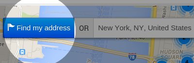
Ideal Store Locator Plugin (iStoreLocator) works with Google Maps API which allows your website visitors to easily locate stores/contacts on the map. You can load a KML, XML OR CSV file with the locations. It also works with Contact Enhanced Component, so it comes packed with a number of features and easy user interface for both the back and the front-end; with the iStoreLocator plugin you can list stores and business locations under different categories.
A powerful and elegant store locator for your website.
We carefully crafted the store locator panel layout to be optimized for the best viewing experience no matter the browsing device you are using. Compatible with Bootstrap version 2 and 3 and HTML5, the easy to customize layout will give your business website visitors a responsive experience that is elegant and intuitive.
Features:
Geolocation Lookup
Built-in Geolocation lookup tool helps users find their current position so they do not have to type their current address to get direction to the nearest store. Click on the 'Find My address' button next to the address to find your current position.
Google Maps Directions
Your website visitors can take advantage of the Google Map Directions by a click on a button. Suggested direction is pointed on the map and step by step directions are displayed on the right.
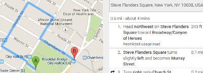
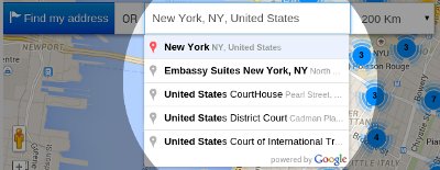
Auto Complete Address Search
The Auto Complete Address Search field provides a type-ahead-search behavior of the Google Maps search field. When a user starts typing an address, autocomplete will fill in the rest. Instead of an address the user can also type places like museums, city halls,...
Marker Clusters
Plotting hundreds of markers on a map can quickly lead to a degraded user experience. Too many markers on the map cause both visual overload and sluggish interaction with the map. To overcome this poor performance, the information displayed on the map needs to be simplified. This is done with Marker Cluster. It works by iterating though the markers and adding each one into the closest cluster if it is within in a minimum square pixel bounds
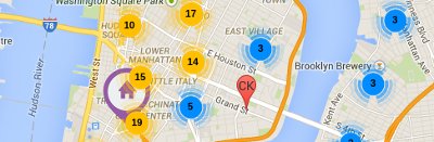
Optimized for mobile devices
Ideal Store Locator is completely optimized and responsive across a wide range of end-user devices to provide an optimal shopping experience for mobile phones, tablets, PC and Mac. It uses the Bootstrap version included in the Joomla source, but it's also compatible with Bootstrap v3 in case your template is loading a more recent version.
Filter by distance
Your website visitors can easily find stores nearby using the distance filter. In the plugin Options you can change the default distance unit
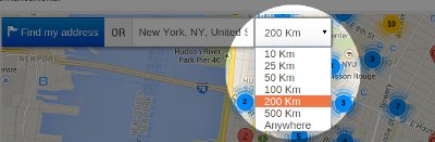
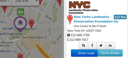
Location/Store info
A list with all locations is displayed on the right of the map. It displays the image, distance to the location and some contact information like address, phone and links to social media. The Show Details button only works when the source is set to Contact Enhanced.
Map Styles
As of version 3 of the Google Maps API custom styles can now be applied to maps. This allows you to pick a style that matches the theme of their website.
You can create your own style using the Google Styled Maps Wizard and copy the JSON code to this field OR use an existing map from snazzymaps.com
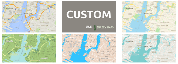
Demonstration
The demo below uses the US Museums database with over 35.000 entries in order to demonstrate how fast iStoreLocator works with a very large database. Search for "New York, NY" for testing purpose.
Installation
- Select Extensions → Extension Manager from the drop-down menu of the Joomla! Administrator Panel. Then select the Install menu item in the Extension manager screen that appears.
- Select the zip file and click on the Upload & Install button;
- Select Extensions → Plugin Manager from the drop-down menu and enable the Ideal Store Locator System Plugin.
Usage
In order to display a Store/Contact Locator add the folloing syntax to a content item (article):
Loads all contacts and sets the height for the map:
{istorelocator height=|600|}
Loads all contacts from category 1 and sets the height for the map:
{istorelocator height=|600| category=|1|}
Loads all contacts from category 1, 2 and 3 and sets the height for the map:
{istorelocator height=|600| category=|1,2,3|}
Ability to filter by city, state and/or country and ignore any search. Example Syntax:
{istorelocator category=|78| filter_city=|Boston| filter_state=|MA| filter_country=|USA| zoom=|10| firstload-loadall=|1| firstload-limit=|9999| firstload-maxdistance=|123456| }
{istorelocator height=|600| source=|xml| file=|GreatBritain-Attractions.xml|} set the source to XML and loads the XML file containing locations
{istorelocator height=|600| source=|csv| file=|Germany-CastleFortSchlossRuins.csv|} Set the source type to CSV (Comma Separated Values) and load file with locations
{istorelocator height=|600| source=|kml| file=|example.kml|} Set source type to KML (Google Earth) and loads file with locations
Plugin Options
Select Extensions → Plugin Manager from the drop-down menu and edit the Ideal Store Locator System Plugin. There you'll find all plugin options like:
Under the "Basic" tab:
- Default location: The initial Map center in case the Auto detect Geo Location fails. Just the latitude and longitude will be used, so this address will not be displayed anywhere.
- Default zoom level;
- Scroll wheel zooming;
- MapType Control;
- Map Type: Roadmap (default and recommended), Satellite, Hybrid, Terrain;
- Navigation Control;
- Home Marker Icon: Defines an image to be used as the home icon for a Marker. Image Directory:
/plugins/system/istorelocator/assets/images/markers - Directions Travel Mode; Default Driving
- Link To Google Maps: When enabled displays a Link to maps.google.com (prefilled with the from and to coordinates) in the direction container
Under the "Map Style" tab:
- As of version 3 of the Google Maps API custom styles can now be applied to maps. This allows you to pick a style that matches the theme of their website.
You can create your own style using the Google Styled Maps Wizard and copy the JSON code to this field OR use an existing map from snazzymaps.com
Under the "Search" tab:
- Position: Location to display the Search form (inside the map OR above it);
- Result Limit: Maximum number of results per search;
- Geolocate: Whether to display a Geolocate button, Geolocate on page load OR both;
- Geolocate button class: Customize the button class using Bootstrap button style (styling may change depending on your front-end template). Options for this template are displayed below, but this might change depending on your template:
- Unit System: The unit system to use when displaying distance. Metric will display in Kilometers and Imperial (English) will display in Miles;
- Max Distance List: Number separated by commas to build a list. Set to 0 to hide and add 123456 to display the "Anywhere" as the last option.
- Selected Max Distance: Select one of the values from the Max Distance List to display as the default value;
Under the "Location List" tab:
- Show route: Whether to hide or show directions button. Also set the Bootstrap button style (styling may change depending on your front-end template). Options are the same as the ones shown in the Geolocate Button Class.
- Show distance: Whether or not show the distance label and it's styling (styling may change depending on your front-end template). Options:Primary Info Success Warning Danger Default
- Source: There are a few options to load the locations: The best option is to load them using:
- Contact Enhanced Component (the best option in our opinion),
- XML (see example) (second best option in our opinion),
- CSV file (see example) (third best option in our opinion);
- KML (see example). KML is the file generated from Google Earth. It's easy to create a file using Google Earth, however it doesn't allow you to use all iStoreLocator features.
- File: The source file for the XML, KML or CSV file. Upload your files to /plugins/system/istorelocator/data/
- Show details: Whether or not show the details button and it's styling. If the source is Contact Enhanced, the details button will link to the Contact page. Styling may change depending on your front-end template.
- Image;
- Webpage;
- Skype;
- Facebook;
- Twitter;
- Miscellaneous (more info);
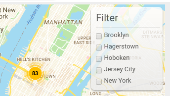
Under the "Filter Groups" tab:
Displays a list of tags (in checkboxes) which allow users to filter the locations by, displaying only locations that match the selected tags. If Marker Clusters option is enabled it will recalculate the markers in each cluster;
The source of the tags can be one of the following:
- Name
- Category Only available when using with Contact Enhanced Component
- Metakey Meta Keywords
- City
- State
- Country
- Postcode
- Tags Only available when using with Contact Enhanced Component
Under the "Language Editor" tab:
If your site is for one language only you can use the options under this tab to change the language strings for this plugin. Otherwise please use the Extensions -> Languages -> Overrides OR translate in Transifex to your language;
Under the "Advanced" tab:
- Force Bootstrap: The script for this plugin is loaded after the page is rendered and in order to avoid incompatibility with other extensions and templates it doesn't load Bootstrap and jQuery by default. If your template or other extensions are not loading these two javascript libraries, than please enable this option and choose which module positions you want to force loading these files;
- Menu Item: Select the Menu Item(s) you want to force loading Bootstrap and jQuery;
- Load FontAwesome: Some icons like the Social media icons are loaded using FontAwesome. You can disable if your template is already loading it;
- Custom CSS: Allows you to add custom CSS rules;
- Custom Javascript: Allows you to add custom Javascript;
Change Log:
Version 3.9.10 (May 08, 2020)
- + Added CSV editor;
Version 3.9.8 (Sept 11, 2019)
- # Fixed Ideal Store Locator search integration with Contact Enhanced Component;
Version 3.9.2 (March 24, 2019)
- # Fixed the search results when using the
filter-searchvariable in the query string with thesearch_fields=metakeyvariable;
Version 3.9.1 (January 18, 2019)
- + Added Fullscreen control options to iStoreLocator;
- - Remove deprecated Joomla! code in order to add compatibility with Joomla! 4.0;
- # Fixed Geolocation feature stating that the daily limit was reached when no query had yet been done;
- + Added option to display prepare More information (Miscellaneous) Field content using Joomla content plugins;
- + Added option to show/hide the instructions and Distance Tool notes on first load;
- # Fixed wrong image and icon path error in the browser's console;
Version 3.7 (Jul/4/2017):
- + Added option to filter by Contact Enhanced Category when the module (included in Contact Enhanced PRO package) is assigned to a CE Category or Categories menu item;
- + Updated Font-awesome library to 4.7.0;
- # Fixed incompatibility with plugins which generated Facebook Open Graph Meta Tags;
- # Fixed Result Limit not working when the source was set to CSV, XML or KML files;
Version 3.6 (Jun/30/2016):
- + Added ability to filter by city, state and/or country and ignore any search. Example Syntax:
{istorelocator category=|78| filter_city=|Boston| filter_state=|MA| filter_country=|USA| zoom=|10| firstload-loadall=|1| firstload-limit=|9999| firstload-maxdistance=|123456| }; - + Ability to GeoCode Contact Enhanced Contacts;
- + Because of a Google Chrome restriction, iStoreLocator won't load the 'Find my Location' button for users using Chrome version 50+ when the site doesn't have a valid SSL certificate (https://);
- + Added ability to add template HTML override. For more information on Template HTML overrides visit the Joomla Documentation.
- # Fixed issue not showing the default Clusterer's image;
- # Fixed issue in iPhone (Safari) zooming in when clicking on the Range (distance) select list (Dropdown);
- + Add ability to filter by city, state and/or country and ignore any search. Example Syntax:
{istorelocator category=|78| filter_city=|Boston| filter_state=|MA| filter_country=|USA| zoom=|10| firstload-loadall=|1| firstload-limit=|9999| firstload-maxdistance=|123456| }; - + Ability to GeoCode Contact Enhanced Contacts;
- # Fixed issue not showing the default Clusterer's image;
- + Ability to auto search using by adding a few search parameters to the query string for example:
https://yoursite.com/path/to/iStoreLocator.html?country=Brazil&city=Curitiba&state=PR
Load all* on First load must be set to No and Geolocate must be set to Show or No - + Ability to edit the Cluster style;
- + Ability to change plugin options in the plugin syntax, overriding content plugin options;
- + Added option to disable auto complete when typing addresses, this way you can ask your users to simply add a zip (postal) code;
- + Improved navigation on mobile devices;
- + Added option to disable Marker Cluster and/or change it's settings;
- + Added option to display a radius circle overlay;
- + Added option to allow users to filter locations by tags (category, metakey, Name, city, state, country or postal code);
- + Added category and metakey fields to the CSV and XML source files in order to be compatible with the filter location;
- + Map is now updated when the search radius select list is changed;
- + Added option to load website link in a new window or on the same window;
- + Added more map controls, now you can choose whether or not to display the StreetView, Pan and Zoom controls and you can also choose their position in the map;
- # Fixed issue when loading all locations at once when source file is XML, KML or CSV;
Ideal Related Articles (iRelated) displays related articles to Joomla articles. Quickly increase your readers' engagement with your articles by adding Ideal Related Articles inside your content. Automatically added Related Articles can increase your internal traffic by up to 10%. Just install and activate. To attract attention and improve SEO you can manually link out to Related Articles across the web from the Article Edit Screen in the Joomla back-end. Search for articles and hand-pick them with ease using the Ajax Auto Complete Search in the administrator area. Plugin supports different styles, thumbnails and is fully customizable;
Introducing SecurImage Captcha Plugin for Joomla – Your Ultimate Defense Against Spam!
SecurImage Captcha is a robust Joomla plugin designed to seamlessly integrate with any Joomla extension utilizing the Joomla core captcha plugin system. Leveraging the power of the Securimage PHP CAPTCHA script, this plugin generates intricate images and CAPTCHA codes, including dynamic math problems, offering unparalleled protection against spam and abuse.
{loadposition securimage-price}
Key Features:
Compatibility Across Extensions:
- Works seamlessly with Joomla Registration, Contact Form Extensions, and other extensions compatible with the Joomla Captcha plugin system.
- Compatible with Contact Enhanced and Ajax Contact for comprehensive protection.
Customizable Security:
- Tailor the code length and character sets for enhanced security.
- Choose from a variety of TTF fonts to personalize the appearance of your CAPTCHAs.
Visual Customization:
- Effortlessly customize colors, add background images, and incorporate unique signatures to captchas, making them visually engaging.
Security Enhancements:
- Incorporates multiple security features such as image distortion, random lines, and noise to thwart automated bots effectively.
Audible CAPTCHAs:
- Button for streaming audible codes, catering to users with visual impairments.
GDPR Compliance:
- Fully compliant with GDPR – prioritizing user privacy by not storing any user information or utilizing cookies.
"Real-time Email Verification"
- Revolutionizing the way you secure your online forms. With this cutting-edge capability, users experience immediate email validation during the form submission process. Included in PRO only for Joomla 4 and newer.
Customization and Versatility:
Word List Support:
- Enhance security by incorporating a word list in your language to further diversify CAPTCHA complexity.
Display Options:
- Choose between alphanumeric captchas or opt for simple math problems for user-friendly engagement.
High Customizability:
SecurImage Captcha offers unparalleled customizability, allowing you to tailor security measures and visual elements to suit the unique needs of your Joomla website.
Say goodbye to spam and unwanted abuse – embrace the security and versatility of SecurImage Captcha Plugin for Joomla today!
Screenshots


Online demo: Support Form
[/tab][tab title="Demo"]
Please visit our demonstration page:
Back-end (Username: demo Password: demo)
Installation
Install the plugin by accessing the administration menu of the back-end under Extensions. Then access Extensions → Plugin Manager, look for Captcha - SecurImage and customize it to your needs. Don't forget to enable it!
The default installation file does not come with the audio files to keep the installation file under 2Mb (on some servers files over 2Mb are not uploadable).
Download audio files:
- Noise files. Unzip and upload the files to /plugins/captcha/securimage/lib/audio/noise/
- Audio: Unzip and upload the files to
[Path to Joomla 3]\plugins\captcha\securimage\lib\audio\
[Path to Joomla 4]\plugins\captcha\securimage\src\Library\SecurImage\audio\ - Portuguese (pt-BR);
- Dutch (nl-NL); Thanks to Chris Gelauff;
- English (en-GB);
- Italian (it-IT);
- Italian (it-IT) Female; Thanks to Claudio Romeo
- Italian (it-IT) Male; Thanks to Claudio Romeo
Usage
We've tried to make it very simple to use Captcha.
- Select Extensions → Plug-in Manager from the drop-down menu of the Joomla! Administrator Panel.
- Edit the Plug-In "Captcha - SecurImage"
- Set Status to "Published"
- Change the settings accordingly to your needs. Below is a screenshot of all the available settings;
- Go to System → Global Configuration, and select the "Site" tab.
Choose "SecurImage" in your "Default Captcha" field.
Click Save & Close. - Depending on the form you need to protect with SecurImage you might have to go to the component Options and enable captcha there;
IMPORTANT: If you are using Akeeba Admin Tools you must access the ".htaccess maker" and add the folder "plugins/captcha/securimage/lib" into "Allow direct access, including .php files, to these directories" in order for the images to generate and be visible.
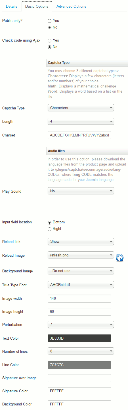
Change log
Version 5.2.4 (April 17, 2024)
- Fixed the Captcha Plugin bug when using the plugin without saving the plugin parameters.
- Added compatibility with Joomla 5.1
Version 5.2.3 (March 08, 2024)
- Fixed problem with TokenHelper Not found.
Version 5.2 (January 08, 2024)
- + Added integration with Joomla User's Allowed Domains for the "Real-time Email Verification" feature (PRO package);
- + Added option to choose which components to display the "Real-time Email Verification" feature;
Version 5.0.2 (December 06, 2023)
- + Added "Real-time Email Verification" feature to PRO package;
Version 5.0 (November 10, 2023)
- # Fixed minor problems;
- + Added option to allow you to specify the file path to the LAME library binary on your server. This setting enables the plugin to convert CAPTCHA audio files into MP3 format, ensuring that they are served as recognizable and playable audio files to users. Leaving blank will serve WAV files only;
- + Added option to randomize the font family;
- + Added more options to get a random number of characters;
- + Added Compatibility with Joomla 5.
Version 4.2 (Sept 13, 2022)
- # Fixed minor problems;
- + Added easier method to add Custom CSS code;
Version 4.0 (Aug 1, 2021)
- + Compatibility with Joomla 4.0;
Version 3.9.1 (January 18, 2019)
- + Updated code removing Joomla Deprecated code;
- - Removed audio captcha from Mobile browsers;
Version 3.8.5 (August 20, 2018)
- + Updated SecurImage library;
Version 3.8.4 (May 02, 2018)
- # Fixed SecurImage Captcha Plugin issue when loading the form is invalid;
Version 3.7 (June 28, 2017)
- + Added partial SecurImage Compatibility with AMP pages in Ajax Mode (reload button won't display for AMP pages). AMP is fully supported in Contact Enhanced's iframe mode;
- + Added several options to SecurImage Captcha plugin in. Now there are separate settings for users using a mobile device/browser;
- # Fixed some minor problems;
Version 3.6.5
- + Updated SecurImage PHP library with improved security;
Version 3.4.8
- + Added audio compatibility with HTML 5, so now the audio feature is compatible with Android and Safari for iOS browsers;
Version 3.3 (June 4, 2014)
- + Added option to display Bootstrap reload button instead of reload image;
- + Added option to add a gap (delay) between letters in Audio Captcha;
- + Added new free fonts;
- + Added new images for the audio captcha play button;
- # Changed SecurImage library to the latest version;
- # Fix "Click me" feature;
1 SecurImage library is a open source PHP script available at PHPCaptcha.org
In the ever-evolving landscape of digital customer support, Wonderchat.io emerges as a game-changer, providing businesses with a powerful tool to enhance their customer experience. Now, with this FREE plugin, integrating Wonderchat.io into any Joomla site has never been easier, opening doors to the seamless implementation of AI-powered chatbots.
What is Wonderchat.io?
Wonderchat.io stands as a revolutionary platform, empowering users to create AI-driven chatbots effortlessly. Leveraging the advanced capabilities of ChatGPT, Wonderchat.io allows users to craft personalized chatbots using their website's knowledge base or by uploading PDF files. The result? A custom chatbot ready to engage with customers 24/7 in just 5 minutes.
Advantages of Wonderchat.io
1. Swift Chatbot Creation:
- Build a ChatGPT-powered chatbot within a mere 5 minutes, ensuring a quick setup for businesses.
2. Customization:
- Reflect your brand identity by customizing the chatbot's role, profile photo, and response length, maintaining a consistent brand image.
3. Seamless Embedding:
- Easily integrate the chatbot directly onto your Joomla website, enhancing user engagement.
4. Chatlog Review:
- Monitor and analyze customer interactions through chatlog reviews, enabling businesses to gather valuable feedback for continuous improvement.
5. Training Capabilities:
- Enhance chatbot responses by training them with model answers, ensuring accuracy and relevance in customer interactions.
6. Analytics:
- Track the efficacy of your chatbot through customer ratings, providing insights into its performance.
Real-World Applications
Wonderchat.io proves to be versatile, catering to various business needs:
Self-Serve Support:
- Reduce customer support queries by up to 70% with an efficient and responsive chatbot.
24/7 Engagement:
- Engage and retain customers anytime, anywhere, fostering a continuous connection.
Feedback Collection:
- Gather valuable insights from customer interactions, aiding in the refinement of products and services.
Brand Identity:
- Customize the chatbot to mirror your brand's image, ensuring a cohesive online presence.
Integration:
- Seamlessly integrate with over 5000 apps via Zapier, facilitating efficient communication across platforms.
Wonderchat.io Pricing Plans
Choose from various pricing plans tailored to different business needs. There's a Free Plan available for you to test which includes a chatbot with a quota of 10 messages, 50 web pages, and 10 PDF pages. Customizable chatbots, an embeddable chat widget, and chatlog history are part of the package.
How to set up
- Sign up for Wonderchat.io
- After creating an account, follow the on-screen instructions to create a bot.
- Click on the vertical dots > Embed Widget.

- Copy the
data-idattribute.
- Edit the Plugin options and add this information:

Frequently Asked Questions (FAQs)
1. How quickly can I set up a chatbot using Wonderchat.io?
- With Wonderchat.io, you can set up a ChatGPT-powered chatbot in just 5 minutes.
2. Can I customize the Wonderchat.io chatbot appearance?
- Yes, Wonderchat.io allows you to customize the role, profile photo, and response length of your chatbot.
3. How does Wonderchat.io answer questions?
- Wonderchat.io learns from the text on your website or from uploaded PDF files, ensuring it provides accurate and relevant responses.
4. Is my data safe with Wonderchat.io?
- Absolutely! Wonderchat.io prioritizes data protection and ensures that your information remains secure.
5. Can I monitor Wonderchat.io’s performance?
- Yes, you can review chatlogs, gather customer feedback, and monitor the efficacy of your chatbot through customer ratings.
In conclusion, Wonderchat.io, combined with this Plugin, offers an unparalleled solution for businesses seeking to elevate their customer support and engagement. Experience the future of customer interactions with Wonderchat.io, seamlessly integrated into your Joomla or WordPress site.
Disclaimer:
Ideal Extensions is an independent entity and is not affiliated with Wonderchat.io. The Wonderchat Widget for Joomla plugin, created by Ideal Extensions, serves as a facilitator for integrating Wonderchat.io into Joomla or Wordpress sites. While we strive to provide seamless integration and enhance user experience, please note that any issues or queries related to the Wonderchat.io platform itself should be directed to Wonderchat.io's official support channels.
It's important to disclose that Ideal Extensions may receive a commission when users subscribe to Wonderchat.io through our provided link. This commission helps support the development and maintenance of the Wonderchat Widget for Joomla plugin.
Users are encouraged to review Wonderchat.io's terms of service, privacy policy, and any other relevant documentation on their official website. By using the Wonderchat Widget for Joomla plugin, you acknowledge and agree to these terms and understand the independent nature of Ideal Extensions in this collaboration.
Contact Form is one of the most important pages for all websites. AJAX Contact Form is a simple and lightweight form module that allows visitors to contact your site administrator by e-mail very fast and secure.
Using AJAX technology, the whole process is performed without the need for a page refresh, making it very quick and user-friendly.
Ajax Contact Form uses the jQuery library included in Joomla for all javascript, therefore it doesn't load any other Javascript library, which makes the form load very fast.
Features
- Ajax powered form (no need to reload the page);
- Ajax Contact for Joomla 3 has up to 30 custom form fields and for Joomla 4 there's no form fields limit;
- Some of the Form Field Types are Checkbox, radio button, select list, text, and multiple text (textarea), number, calendar,...;
- Can send to several emails at the same time;
- Option to send a file attached to the submitter, great if you are using in a marketing campaign;
- Captcha verification system, powered by SecurImage Captcha plugin, which is a bonus and it is installed automatically with the module;
- Ability to limit the number of characters in the message field;
- It uses jQuery to validate the form and perform the AJAX calls. jQuery is the same library that Joomla uses, therefore there is no need to include a lot of files and the result is a very lightweight module;
- It will get your users IP Address, Browser, Operating System, and Screen resolution
- If the user is logged in this script will get the name and email recorded in the database, preventing the user to mistype his email;
- Customizable EU GDPR privacy check form field;
- Fast and reliable;
Please do not get confused with our other product Contact Enhanced, which is a much more complete extension;
Demonstration
Please visit our demonstration page:
Back-end (Username: demo Password: demo)
Screenshots
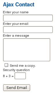
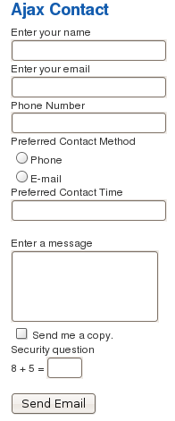
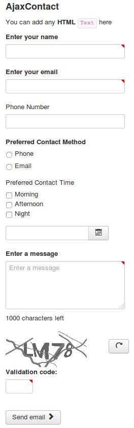
Ajax Contact Parameters for Joomla! 4
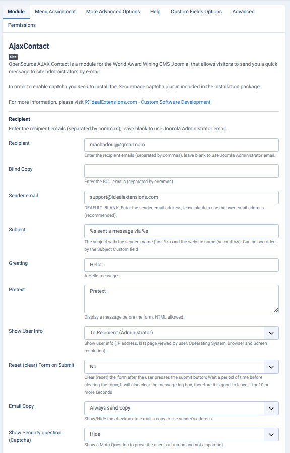
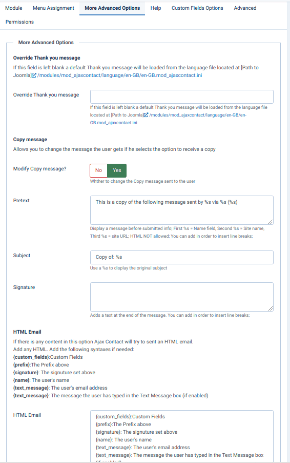
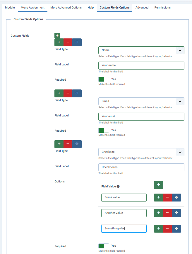
Ajax Contact Parameters for old Joomla versions
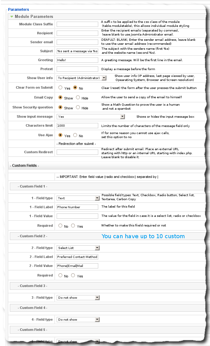
This Name Meaning Component, has over 4100 girls and boys names and meanings in the database, from 47 different origins (American, Arabic, French, Dutch, Greek, Hebrew, Irish, Italian, ...).
It has a back-end interface that makes it very easy to add new names and to edit existing ones.
Features
- Over 4100 Names and Meanings from 48 different origins;
- Better admin interface to add and manage names and origins;
- Thumbs Up and Down voting system;
- Search for a name starting with, ending with, containing the search word;
- Additional info;
- Will be able to sort items for:
- Most voted;
- Better voted;
- Most hits;
- Least hits;
- More popular (As people add to their list the name will become more popular)
- Least popular;
- Now you can enter an Unisex name;
- Import names from a CSV;
- Totally rewritten for Joomla!™ 3, assuring a higher compatibility and best coding practices;
Modules
Modules included in the package:
- Name Search: Displays a search form with a few options;
- Gender: The user can choose whether to show boys or girl names;
- Alpha Index: Displays an A through Z links
Demonstration Page
Please visit the demonstration page:
Back-end (Username: demo Password: demo)
If you want to collect feedback from your website visitors and provide your social media links in a simple and elegant way, you might want to try the CE feedback button plugin. This plugin allows you to add a customizable feedback button to the side of your website, which opens a modal window where users can leave comments or visit your social media.
The CE Feedback is a plugin that adds a Feedback button as a sidebar on your site and when clicked it loads a feedback form using Contact Enhanced to allow any website user to leave a comment on your site. It loads in a modal window using Joomla default's modal window, so if your customer has a question about a particular page he can submit a feedback form without ever leaving the page.
The plugin lets you change the text color, background color, inner shadow color, font-size, and font-family of the button to match the look and feel of your website. You can also choose where to position the button on your website and what action to trigger when the button is clicked.
This plugin requires Contact Enhanced Component in order to display the contact form and it's already included in the Professional and Developer Subscriptions, so there's no need to purchase this plugin if you've purchased one of those subscriptions. The Social Media features don't require Contact Enhanced component. The plugin is easy to install and configure.
Other features:
- Every feedback form can also record information about the client's browser, operating system, screen resolution, and IP address;
- No plugins like Flash or Java are needed, no problem with popup blockers;
- Unobtrusive behavior, visitors with disabled JavaScript or old browsers can still be able to submit the form (in this case it will not load in a modal window);
- Simple and intuitive behavior: loading-indicator, close button, and changing icons describe possible interactions;
- All Contact Enhanced Features like Custom Fields, GMaps & directions integration, HTML templates & emails, CAPTCHA, Campaign Monitor Newsletter integration, and much more;
Usage:
 CE Feedback Layout Parameters, click on the image to enlarge
After regular installation, select Extensions → Plugin Manager (in Joomla 3) or select System → Manage panel → Plugins from the sidebar menu on the Back-end of your Joomla! 4+ and select the System - Feedback plugin. Then you can configure these parameters illustrated below.
There are three important tabs we'll cover in this tutorial:
- Layout: Where the positioning and main colors of the Feedback button are defined;
- Feedback button: Where the Feedback button label, link, and behavior are defined,
- Social buttons: Where the social media button labels, links, and colors are defined.
Layout:
- Position: Whether to display on the right or left of your page; It will only display the slide-out effect for the social media links when it's set to display on the left position.
- Distance from the top: The distance in pixels from the top of the page.
- Button style:
- Text Color: This is the color of the text on the button. You can choose any color from the color picker or enter a hex code.
- Background Color: This is the color of the button background. You can choose any color from the color picker or enter a hex code.
- Inner Shadow Color: This is the color of the inner shadow effect on the button. You can choose any color from the color picker or enter a hex code.
- Font Size: This is the size of the text on the button. You can enter any number in pixels, such as 14, 16, 18, etc.
Font Family: This is the font family of the text on the button. You can choose any font from the drop-down list.
- Button style for mouse-over effect.
Feedback button
 CE Feedback Feedback button Parameters, click on the image to enlarge
- Link Text: This is the text that will appear on the button. You can enter any text that you want, such as "Feedback", "Contact Us", "Help", etc.
- What to load: This is the action button. This is what you want to happen when the button is clicked. You can choose from three options: Contact Enhanced Form, Article, or URL.
- Select Contact: When the Contact Enhanced Form option is selected, you'll see an option to select a Contact Enhanced > Contact. You have to select which contact you want the plugin to load. This was implemented so you could customize your Feedback form any way you want. You might need to add this contact to a new category, so it can have its own form fields;
- Select an Article: When the Article option is selected you have to select which article you want to load when the button is clicked
- Link: A URL to the page you want to load. This can be an external or internal URL;
- Load on a Modal Window: Whether or not to load the Feedback content (Form, Article, or URL) on a modal window or not. If set to Yes, then you'll see the options below
- Use Template: This option allows you to choose the template for the modal window. You can select from the default Joomla templates or any custom templates that you have installed. The template will determine the appearance and style of the modal window's content for the Contact Enhanced form, Article, or internal links.
- Modal window title: This option allows you to set the title of the modal window. You can enter any text that you want to display at the top of the modal window. You can also use HTML tags to format the title. If you leave this option blank, the feedback Link text will be shown.
- Modal window footer: This option allows you to set the footer of the modal window. You can enter any text that you want to display at the bottom of the modal window. If you leave this option blank, no footer will be shown.
- Window Height: This option allows you to set the height of the modal window. You can enter a value in pixels. The height will determine how much space the modal window will occupy on the screen. If you leave this option blank, the height will be automatically adjusted according to the content and browser' window size.
Social Links
 CE Feedback Layout Parameters, click on the image to enlarge
You'll see a Repeatable Field which allows you to add as many social media links as you want.
- Link label: This is the text that will appear next to the icon. You can use any name you want, such as "Facebook", "Twitter", "Instagram", etc.
- Link URL: This is the URL of your social media profile. Make sure to include the https:// prefix, such as https://www.facebook.com/yourname.
You can use the following shortcodes in the URL parameter: [current_page] [current_url] [site_name] [site_url] - CSS Class icon: This is the name of the icon class that will be used for the link. Most templates already load their own Icon fonts or use a n Icon font such as Font-Awesome. Therefore, in order to improve performance, this plugin does not load any icon font by default. Contact Enhanced Icon Library will be loaded only if you use its icon prefix (iconce-). You can choose from a variety of icons provided by Font Awesome if your template already loads it. If you are using it with Contact Enhanced, For example, if you want to use the Facebook icon, you can enter "fab fa-facebook-f". You can find the full list of icons here: https://fontawesome.com/icons?d=gallery&s=brands
- Background color: This is the color of the icon background. You can use any hex code or color name, such as "#3b5998" or "blue".
Color suggestions:Facebook (#4267B2), Twitter (#1DA1F2), Instagram (#E1306C), LinkedIn (#2867B2), Github (#333333), Youtube (#ff0000), WhatsApp (#075e54) - Link target: This is the option to open the link in a new ta, the same tab, or on a modal window.
iAkismet is a plugin that integrates the popular anti-spam service Akismet.com with with the following extensions in order to stop spam.
Unlike other anti-spam services, Akismet does not present the visitor with captchas. Instead it scans the visitor's post, name and email address and runs hundreds of tests to determine whether it's spam or not. It's a completely automated way to protect your forms from spammers.
Currently this plugin works with:
- Joomla User Registration
- Joomla core Contacts component
- Contact Enhanced Component 3.3.3+ and 2.5.24+
- Kunena 3+
- iFormBuilder 3.3+
- Ajax Contact 3.3+
- Ajax Recommend 3.3+
- iRecommend 3.3+
Access to get a FREE or commercial API key from akismet.com and simply paste it back in the plugin options. Don't forget to enable the plugin and it should already start blocking undesired spam messages and posts.
Demonstration Page
API
If you are a developer and want to integrate this plugin with your extensions follow the instructions below:
Add this code to controller that process your form:
JPluginHelper::importPlugin('system');
$app 	= JFactory::getApplication();
$dispatcher= JDispatcher::getInstance();
$spamCheckData = array();
$spamCheckData['name']    = $name;    // The User's name from teh form
$spamCheckData['email']   = $email;   // The email from the form
$spamCheckData['message'] = $message; // The Message content
// Check with spamCheck plugins
$results	= $dispatcher->trigger('onSpamCheck', array('com_contactenhanced.submit', &$spamCheckData));
// Check for errors encountered while checking for spam
if (count($results) && in_array(false, $results, true))
{
	$error = $dispatcher->getError();
	$app->enqueueMessage($error, 'error');
	// you might need to add a redirection:
	//$app->redirect(JRoute::_('index.php?option=com_yourextension&view=someview', false), $error);
	return false;
}
That's it! ;-) Akismet plugin will take care of the rest.
This module allows you to help people to get involved with some campaigns, either donating to Joomla!, getting people to download Firefox or more importantly helping to extinguish Poverty (MakePovertyHistory.org), giving food to the Hungry and stopping Global Warming. It's very simple and easy to configure the module and engage in one of the campaigns bellow.
The module is fully customizable (image, text and link). This way you not only can translate the text for each campaign OR you can promote your own campaign!
You can have one of the corner images pre-defined or make your own... corner image that comes in the module:


{jatabs type="content"} [tab title="Campaigns"]
- Joomla!™ - Suport Joomla!™
- MakePovertyHistory
- Hope Unlimited for Children - Transforming the lives of street kids.
- Stop Global Warming (stopGlobalWarming.org)
- There are over 9 Million refugee children (http://nineMillion.org)
- For every child: Health, Education, Equality, Protaction,... (http://unicef.org)
- Race for the Breast Cancer Cure (http://komen.org)
- The Hunger Site - Clique to give FREE Food!
- American Red Cross
- I'm Ready - American Red Cross (Download I'm Live Messenger and help American Red Cross to help people)
- Spread FireFox
- GreenPeace
- 3 Twitter images;
- Wordpress;
- Facebook.
[/tab] [tab title="Images"]
Available corner images in the module:


[/tab] [tab title="Throubleshoot"]
Solving Problems
Problem reported:
I can't get the image to show all the way in the corner, instead it shows in the site content!
Solution:
Open your template index.php file. in case you are using a JoomlArt template, then you have to edit another file instead: /plugins/system/jat3/base-themes/default/page/default.php
Right before the </body> tag you can add this:
<jdoc:include type="modules" name="campaign" />
Then you must publish this module to the campaign position.
[/tab] {/jatabs}
This Component allows you to show a module in the main content area, just as if the module was a component.
There are a few Menu parameters: Menu Image, position to load, Title and Description.
You can create as many menu items as you wish with only one component installation!
Small Donations are always welcomed!
How to use
- After default installation, select Menus → [name of the menu] from the drop-down menu on the back-end of your Joomla! installation. For example, if a Menu is called "Main Menu", select Menus → Main Menu.
- Click the "New" button;
- Choose M2C;
- Add a Module Position to load under the Parameters (Component). See screenshot below:
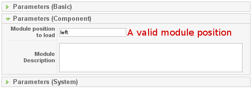
Mailto2CE is a System plugin for Contact Enhanced that will convert all mailto links like: <a href="mailto:someone@domain.com">some text</a> to a link to Contact Enhanced form.
It will encode the email, so you will not have any problems with E-mail address harvesting* bots; This way you will avoid spam and keep your emails addresses on your web page safe;
This plugin requires Contact Enhanced Component and it's already included in the Contact Enhanced Developer Subscription, so if you have the Developer's subscription there's no need to purchase it.
Usage for Joomla 4:
- Select System → Manage panel → Plugins from the Administrator menu.
- Make sure the Contact Enhanced → Content Plugin is enabled. The Mailto2CE plugin for Joomla 4 requires that the Contact Enhanced Plugin is enabled as it uses this plugin to create the links;
- Edit the Mailto2CE System Plugin and select which Contact Enhanced → Contact you want to load the form. Mailto2CE plugin will send the email to the email address in the mailto link, regardless of the contact selected.
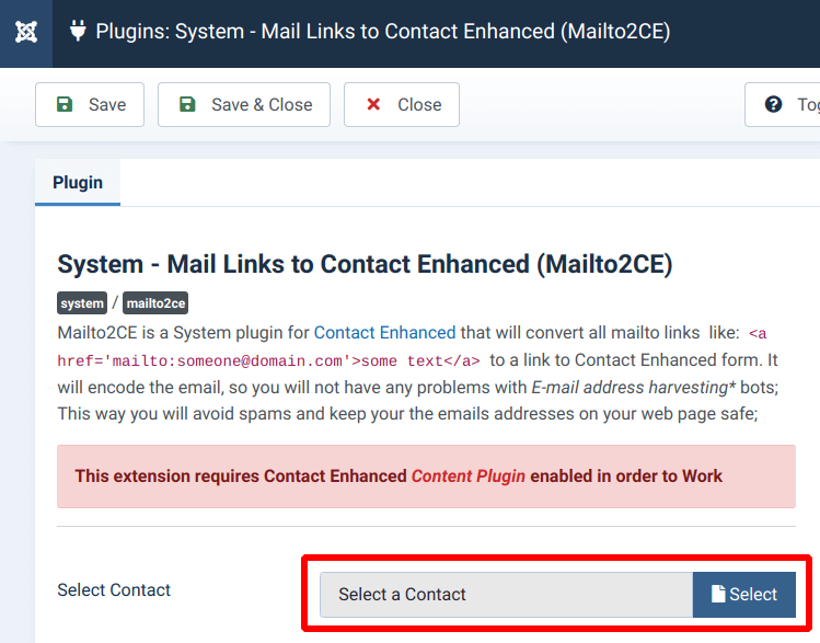
Usage for Joomla 3:
After regular installation, select Extensions → Plugin Manager from the drop-down menu on the Back-end of your Joomla! installation and select the System - Mailto2CE. Then you can configure these 4 parameters illustrated below:
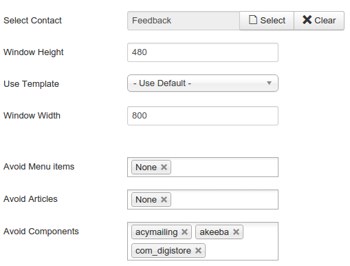
Example:
The link below is a mailto link transformed to a link to Contact Enhanced
* E-mail harvesting is the process of obtaining lists of e-mail addresses using various methods for use in bulk e-mail or other purposes usually grouped as spam.
Contact Enhanced
Event Properties
- x -Mouse x coordinate when the event happened.
- y -Mouse y coordinate when the event happened.
JavaScript defines five types of events which are form, image, image map, link, and window events. Events are associated with HTML tags. The definitions of the events described below are as follows:
Form Events
- blur - The input focus was lost.
- change - An element lost the focus since it was changed.
- focus - The input focus was obtained.
- reset - The user reset the object, usually a form.
- select - Some text is selected
- submit - The user submitted an object, usually a form.
Image Events
- abort - A user action caused an abort.
- error - An error occurred.
- load - The object was loaded.
Image Map Events
- mouseOut - The mouse is moved from on top a link.
- mouseOver - The mouse is moved over a link.
Link Events
- click - An object was clicked.
- mouseOut - The mouse is moved from on top a link.
- mouseOver - The mouse is moved over a link.
Window Events
- blur - The input focus was lost.
- error - An error occurred.
- focus - The input focus was obtained.
- load - The object was loaded.
- unload - The object was exited.
Event Association
Events are associated with HTML tags. The definitions of the events described below are as follows:
- abort - A user action caused an abort of an image or document load.
- blur - A frame set, document, or form object such as a text field loses the focus for input.
- click - Happens when a link or image map is clicked on
- change - Happens when a form field is changed by the user and it loses the focus.
- error - An error happened loading a image or document.
- focus - A frame set, document, or form object such as a text field gets the focus for input.
- load - The event happens when an image or HTML page has completed the load process in the browser.
- mouseOut - The event happens when the mouse is moved from on top of a link or image map
- mouseOver - The event happens when the mouse is placed on a link or image map.
- reset - The user reset the object which is usually a form.
- submit - The user submitted an object which is usually a form.
- unload - The object such as a framesed or HTML document was exited by the user.
The events for each HTML tag are as follows:
- <A>
- click (onClick)
- mouseOver (onMouseOver)
- mouseOut (onMouseOut)
- <AREA>
- mouseOver (onMouseOver)
- mouseOut (onMouseOut)
- <BODY>
- blur (onBlur)
- error (onError)
- focus (onFocus)
- load (onLoad)
- unload (onUnload)
- <FORM>
- submit (onSubmit)
- reset (onReset
- <FRAME>
- blur (onBlur)
- focus (onFocus)
- <FRAMESET>
- blur (onBlur)
- error (onError)
- focus (onFocus)
- load (onLoad)
- unload (onUnload)
- <IMG>
- abort (onAbort)
- error (onError)
- load (onLoad)
- <INPUT TYPE = "button">
- click (onClick)
- <INPUT TYPE = "checkbox">
- click (onClick)
- <INPUT TYPE = "reset">
- click (onClick)
- <INPUT TYPE = "submit">
- click (onClick)
- <INPUT TYPE = "text">
- blur (onBlur)
- focus (onFocus)
- change (onChange)
- select (onSelect)
- <SELECT>
- blur (onBlur)
- focus (onFocus)
- change (onChange)
- <TEXTAREA>
- blur (onBlur)
- focus (onFocus)
- change (onChange)
- select (onSelect)
Event Handlers
Event handlers are created as follows:
onEvent = "Code to handle the event"
The following example demonstrates its use:
<a href="/independent/index.html" target="_top" onMouseOver="window.status='To Independent Technologies Section' ;return true" onMouseOut="window.status='';return true"><img SRC="gifs/greenindependentbutton2.gif" ALT="Independent Technologies" VSPACE=3 BORDER=0 height=35 width=120></a><BR>
As you can see, the event handling attribute is included in the HTML tag. When multiple statements are included in the event handling code, the statements are separated by a semicolon.
The following example can be used to redirect a link to another location:
<HTML>
<HEAD>
<TITLE>Using functions as event handlers</TITLE>
<SCRIPT LANGUAGE="JavaScript">
<!--
function nameDefined(ckie,nme)
{
   var splitValues
   var i
   for (i=0;i<ckie.length;++i)
   {
      splitValues=ckie[i].split("=")
      if (splitValues[0]==nme) return true
   }
   return false
}
function delBlanks(strng)
{
   var result=""
   var i
   var chrn
   for (i=0;i<strng.length;++i) {
      chrn=strng.charAt(i)
      if (chrn!=" ") result += chrn
   }
   return result
}
function getCookieValue(ckie,nme)
{
   var splitValues
   var i
   for(i=0;i<ckie.length;++i) {
      splitValues=ckie[i].split("=")
      if(splitValues[0]==nme) return splitValues[1]
   }
   return ""
}
function testCookie(cname, cvalue) {  //Tests to see if the cookie
   var cookie=document.cookie        //with the name and value
   var chkdCookie=delBlanks(cookie)  //are on the client computer
   var nvpair=chkdCookie.split(";")
   if(nameDefined(nvpair,cname))  //See if the name is in any pair
   {
      tvalue=getCookieValue(nvpair,cname)  //Gets the value of the cookie
      if (tvalue == cvalue) return true
	   else return false
   }
   else return false
}
function redirectLink() {
   if (testCookie("javahere", "yes")) {
      window.location="javahere.html"
   }
   else{
      var futdate = new Date()
      var expdate = futdate.getTime()
      expdate += 3600*1000  //expires in 1 hour(milliseconds)
      futdate.setTime(expdate)
      var newCookie="javahere=yes; path=/;"
      newCookie += " expires=" + futdate.toGMTString()
      window.document.cookie=newCookie
      window.location="javanot.html"
   }
}
//-->
</SCRIPT>
</HEAD>
<BODY>
<H3>Using an event handler to direct a link based on a cookie value</H3>
<P>
<A NAME="Here" onClick="return redirectLink()">See if you've been here.</A>
</P>
</BODY>
</HTML>
| Before installation: Joomla comes with a core program for contacts. You must first set up users. To do this, go to the "Control Panel". Select "User Manager". Now, add the users you will need for your contact form(s). | |
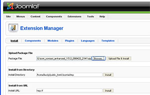 | Log in to Joomla's Administrative area. Select "Extentions" Select "Browse Files" Select the package file you have just received by email. Select "Upload and Install." |
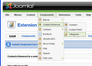 | Once the program is installed, choose "Components" Scroll to "Contact Enhanced" You must first set up categories. Choose "Categories" When the category screen appears, in the upper right corner, choose "New".
|
For the "Title", type in "Sales Department". Save the category.
Again, select "New" and for the "Title", type in "Support". Save the category. | |
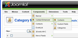 | You now need to set up your contacts. Go to Components > Contact Enhanced > Contacts Select "New" In the "Name" field, type in: Pre-sales Questions In the "Category" field, select Sales Department. In the "Linked to User" field, choose your preferred contact person. |
JavaScript Style Attributes
Listed below are the tables of CSS properties for various HTML element style attributes. I have added a column indicating the javaScript name that the browser recognizes for these properties. I have only listed those that I know work, but the trend seems to be to use the same name when one name is the style descriptor. When there are two names, use the first name in lower case and the first character of the second name in upper case. Examples:
- color = color
- background-color = backgroundColor
- font-style = fontStyle
- font-weight = fontWeight
Box Properties
| Name | JavaScript Name | Description | Possible Values | Element Types | Example | inherited |
|---|---|---|---|---|---|---|
| border | Sets border width, style and color. | See border width, style, and color | All | {border: medium solid green} | No | |
| border-bottom | Set the bottom border width style, and color. | See border width, style, and color | All | {border-bottom: medium solid green} | No | |
| border-bottom-width | Set the bottom border width | thin, medium, thick, or length value | All | {border-bottom-width: thin} | No | |
| border-color | Set the border color | A color value, color, #RRGGBB | All | {border: #0000ff} | No | |
| border-left | Set the left border width style, and color. | See border width, style, and color | All | {border-left: medium solid green} | No | |
| border-left-width | Set the left border width | thin, medium, thick, or length value | All | {border-left-width: thin} | No | |
| border-right | Set the right border width style, and color. | See border width, style, and color | All | {border-right: medium solid green} | No | |
| border-right-width | Set the right border width | thin, medium, thick, or length value | All | {border-right-width: thin} | No | |
| border-style | Sets border style | none, dotted, dashed, solid, double, groove, ridge, inset, outset | All | {border: dashed} | No | |
| border-top | Set the top border width style, and color. | See border width, style, and color | All | {border-top: medium solid green} | No | |
| border-top-width | Set the top border width | thin, medium, thick, or length value | All | {border-top-width: thin} | No | |
| border-width | Sets Border width. | thin, medium, thick, or length value | All | {border-width: 8} | No | |
| clear | Determines where floating elements are allowed. | none, left, right, both | All | {clear: left} | No | |
| float | Specifies how text is wrapped and where it is aligned. | none, left, right | All | {float: left} | No | |
| height | Height of element | auto or a height value | Block elements and IMG, INPUT, TEXTAREA, SELECT, and OBJECT | {height: 200} | No | |
| margin | Set element margin width. A single value sets all margins, two values set top and bottom, four values set top, right, bottom, and left margins. | auto, length value, or percent value | All | {margin: 4em 2em 4em 2em} | No | |
| margin-bottom | marginBottom | Set element bottom margin | length value, or percent value | All | {margin-bottom: 4em} | No |
| margin-left | marginLeft | Set element left margin | length value, or percent value | All | {margin-left: 4em} | No |
| margin-right | marginRight | Set element right margin | length value, or percent value | All | {margin-right: 4em} | No |
| margin-top | marginTop | Set element top margin | length value, or percent value | All | {margin-top: 4em} | No |
| padding | Space between border and content. A single value sets all sides, two values set top/bottom and left/right, three values set top, right/left, and bottom, and four values set top, right, bottom, and left. | length value, or percent value | All | {padding: 4em} | No | |
| padding-bottom | Space between bottom border and content. | length value, or percent value | All | {padding-bottom: 4em} | No | |
| padding-left | Space between left border and content. | length value, or percent value | All | {padding-left: 4em} | No | |
| padding-right | Space between right border and content. | length value, or percent value | All | {padding-right: 4em} | No | |
| padding-top | Space between top border and content. | length value, or percent value | All | {padding-top: 4em} | No | |
| width | Width of element | auto or a height value in length or percentage | Block elements and IMG, INPUT, TEXTAREA, SELECT, and OBJECT | {width: 40em} | No |
Background and Color Properties
| Name | JavaScript Name | Description | Possible Values | Element Types | Example | inherited | |
|---|---|---|---|---|---|---|---|
| background | Set background color, repeat, image, attachment, or position. | See background-color, background-image, background-attachment, background-repeat, background-position | All | {background: #8080ff} | No | ||
| background-attachment | Determines if the background image is fixed or scroll. | scroll, fixed | All | {background-attachment: scroll} | No | ||
| background-color | backgroundColor | Sets the background color. | Named or value color | All | {background-color: #8080ff} | No | |
| background-image | Sets the background image. | url | All | {background-image: url('../../../../gifs/flowers.gif')} | No | ||
| background-position | Sets the background image initial position. | top, center, bottom, left, center, right, or percent values | Block and IMG, INPUT, TEXTAREA, SELECT, and OBJECT | {background-position: left top} | No | ||
| background-repeat | Sets how the background image is repeated. | repeat, repeat-x, repeat-y, no-repeat | All | {background-repeat: no-repeat} | No | ||
| color | color | Sets element color. | Named or value color | All | {color: green} | Yes |
Classification Properties
| Name | JavaScript Name | Description | Possible Values | Element Types | Example | inherited |
|---|---|---|---|---|---|---|
| display | Sets the type of element. | block, inline, list-item, none | All | {display: list-item} | No | |
| list-style | listStyle | Sets list style type and/or position. | See list-style-type and list-style-position | List-item | {list-style: circle} | Yes |
| list-style-image | Sets image to be used as the list item marker. | url | List-item | {list-style-image: url(this.gif)} | Yes | |
| list-style-type | Sets list style type. | circle, disc, decimal, lower-alpha, lower-roman, none, square, upper-alpha, upper-roman | List-item | {list-style-type: square} | Yes | |
| list-style-position | Sets where the marker is place relative to the text and its wrapping position. | inside, outside | List-item | {list-style: circle} | Yes | |
| whitespace | Sets treatment of spaces inside the element. | normal, pre, nowrap | Block | {whitespace: pre} | Yes |
Font Properties
| Name | JavaScript Name | Description | Possible Values | Element Types | Example | inherited |
|---|---|---|---|---|---|---|
| font | Used to define font properties | See font-family, font-size, font-style, font-variant, and font-weight. | All | {font: 20pt} | Yes | |
| font-family | fontFamily | Used to define font family to use | family name | All | {font-family: ariel roman} | Yes |
| font-size | Used to define font size to use | xx-small, x-small, small, medium, large, x-large, xx-large, larger, smaller, length value, or percent value | All | {font-size: 18pt} | Yes | |
| font-style | fontStyle | Used to define font style to use | normal, italic, oblique | All | {font-style: italic} | Yes |
| font-variant | fontVariant | Used to determine whether to use normal or small caps | normal, small-caps | All | {font-variant: small-caps} | Yes |
| font-weight | fontWeight | Sets font weight. | normal, bold, bolder, lighter, 100, 200, 300, 400, 500, 600, 700, 800, 900 | All | {font-weight: 600} | Yes |
Text Properties
| Name | JavaScript Name | Description | Possible Values | Element Types | Example | inherited |
|---|---|---|---|---|---|---|
| letter-spacing | Sets the space between characters. | normal or length value | All | {letter-spacing: 0.2em} | Yes | |
| line-height | lineHeight | Sets the height of lines. | normal, a number, a percent of the element font size, | All | {line-height: 2} | Yes |
| text-align | textAlign | Sets the alignment of text. | left, right, center, justify | Block | {text-align: center} | Yes |
| text-decoration | textDecoration | Sets the special decoration attributes of text. | none, overline, underline, line-through, blink | All | {text-decoration: blink} | No |
| text-indent | textIndent | Sets the element's first line amount of indentation. | length or percentage value | Block | {text-indent: 5%} | Yes |
| text-transform | textTransform | Transforms text to one of the set values. | none, capitalize, uppercase, lowercase | All | {text-transform: uppercase} | Yes |
| vertical-align | verticalAlign | Sets vertical position. | baseline, sub. super, top, middle, bottom, text-top, text-bottom, or percent value | Inline | {vertical-align: sub} | No |
| word-spacing | Sets extra space between words. | normal or length value | All | {word-spacing: 0.2em} | Yes |
Feedback
These guidelines are intended as a work-in-progress and will continue to be informed by feedback from users and staff members. Ideas about and suggestions for improvement of the document can be forwarded using our forum and email form. If you made a screencast or a tutorial, you can post on the forum or send it to us by email.
How to get the this Joomla Extension
With our automated payment and delivery process, you could be downloading and installing your new component in a few minutes! We use PayPal as our payment processor. It is one of the most preferred payment methods on the internet. You are not obligated to sign up with PayPal, so you can also just make a onetime purchase using your favorite creditcard.
{tab=Screencasts}All Screencasts on available on this page were produced by Dale, the nicest Canadian lady I've ever "met". Thanks Dale!
Installation Instructions
Screencast by Dale
Editing HTML Templates
Contact Enhanced Plugin
Screencast by Dale
Setting up Google Maps + Security
Screencast by Dale
{tab=Contact Enhanced}Contact Enhanced Manager
How to access
Select Components → Contact Enhanced → Contacts from the drop-down menu on the back-end of your Joomla! installation.
Description
The Contact Enhanced Manager screen allows you to add contact information to your Joomla! site. You can enter information such as name, address, phone and e-mail. You can also link contacts to registered users. Afterwards, you can use the Menu Manager to create front-end links to the the contacts.
Screenshot

Column Headers
Click on the column heading to sort the list by that column's value.
#. An indexing number automatically assigned by Contact Enhanced for ease of reference.
Checkbox. Check this box to select one or more items. To select all items, check the box in the column heading. After one or more boxes are checked, click a toolbar button to take an action on the selected item or items. Many toolbar actions, such as Publish and Unpublish, can work with multiple items. Others, such as Edit, only work on one item at a time. If multiple items are checked and you press Edit, the first item will be opened for editing.
Name. The name of the Contact. You can click on the Name to open the Contact for editing.
Published. Whether the item has been published or not. You can change the Published state by clicking on the icon in this column.
Order. The order to display items. If the list is sorted by this column, you can change the order by clicking the arrows or by entering the sequential order and clicking 'Save Order'. Note that the display order on a page is set in the Parameters - Advanced section for each Menu Item. If that order is set to use something other than 'Order' (for example, 'Title - Alphabetical'), then the order value in this screen will be ignored. If the Menu Item Order parameter is set to use 'Order', then the items will display on the page based on the order in this screen.
Access Level. Who has access to this item. Current options are:
Public: Everyone has access
Registered: Only registered users have access
Special: Only users with author status or higher have access
Category. The Category that this Contact belongs to. Clicking on the Category Title opens the Category for editing. Note that Contact Categories are separate from other Categories, such as those for Articles, Banners, Newsfeeds, and Web Links.
Linked to User. The username this contact is linked to (if applicable).
ID. The ID number. This is a unique identification number for this item assigned automatically by Contact Enhanced. It is used to identify the item internally. You can not change this number.
Display #. The number of items to display on one page. If there are more items than this number, you can use the page navigation buttons (Start, Prev, Next, End, and page numbers) to navigate between pages. Note that if you have a large number of items, it may be helpful to use the Filter options, located above the column headings, to limit which items display.
Toolbar
At the top right you will see the toolbar:

The functions are:
Publish. To publish one or more items, select them and click on this button.
Unpublish. To unpublish one or more items, select them and click on this button.
Delete. To delete one or more items, select them and click this button. The selected items will be deleted.
Edit. Select one item and click on this button to open it in edit mode. If you have more than one item selected, the first item will be opened. You can also open an item for editing by clicking on its Title or Name.
New. Click on this button to create a new item. You will enter the New page for this item.
Parameters. See Global Configuration section below.
Help. Opens this Help Screen.
Global Configuration
Click the Parameters button to open the Contact Enhanced Global Configuration window. This window allows you to set default parameters for Contact Enhanced, as shown below.

Save. Press Save to save your settings.
Cancel. Press Cancel to cancel your changes.
- Captcha. Press Disable to disable Captcha in all forms
- Thank you message. What message to show after the form is submitted. Select an option from the list:
- Joomla Default: Displays a "Thank you message" right above the form;
- Show sent email message: Shows to the user the email that was just sent;
- Javascript Alert: Shows a Thank you message in a Javascript Alert style;
- Custom Redirect:The page is going to be redirected to the URL listed in the Custom Redirect option.
- Custom Redirect: Redirect after submit email. Place an external URL starting with http or an internal URL starting with index.php;
- Show User Info: Show User Info on email. User info = IP, Operating System, Screen size and Web Browser;
- Max File Size: Max File size (in Kb) for attachments files;
Icons/Text. Whether an Icon, Text or nothing is displayed next to the Contact fields.
Address Icon. Icon to use for Address. Select an image file in the drop-down list box. These images are located in the 'images/M_images' folder.
E-mail Icon. (Hide/Show/Use Global) Whether or not to display a button to allow a link to the Article to be e-mailed. This displays a form that allows the user to send an e-mail with a link to the current Article.
Telephone Icon. Icon to use for Telephone. Select an image file in the drop-down list box. These images are located in the 'images/M_images' folder.
Mobile Icon. Icon to use for Mobile phone. Select an image file in the drop-down list box. These images are located in the 'images/M_images' folder.
Fax Icon. Icon to use for Fax. Select an image file in the drop-down list box. These images are located in the 'images/M_images' folder.
Miscellaneous Icon. Icon to use for Miscellaneous. Select an image file in the drop-down list box. These images are located in the 'images/M_images' folder.
Show Table Headings. Hide or Show the column headings (Name, Address, and so on) in the Contact Category Layout.
Show Contact Position. Hide or Show the Contact's Position.
Show E-mail Address. Hide or Show the Contact's E-mail address.
Show Telephone Number. Hide or Show the Contact's Telephone number.
Show Mobile Number. Hide or Show the Contact's Mobile phone number.
Show Fax Number. Hide or Show the Contact's Fax number.
Enable vCard. Whether or not to enable vCard support for Contacts. vCard is a special file format for electronic business cards. This allows contact information to be sent in a standard way via e-mail. Note that this parameter must be set to "Yes" for the vCard feature to work. If this parameter is "No" and vCard is set to "Show" for a Contact, the vCard link will show but the link will not work correctly. It will only show a blank screen.
Banned E-mail. Enter any e-mails to be banned from the site. E-mail addresses containing any of the listed text will be banned. Separate different words with semi-colons ';'. For example, the entry "spam;junk" would ban e-mail addresses such as "myspam@.com" or "aeddie@junkisgood.com".
Banned Subject. Enter any e-mail subject words to be banned from the site. Separate different words with semi-colons ';'. For example, the entry "spam;junk" would ban e-mail subjects such as "This is not spam" or "I Like Junk".
Banned Text. Enter any e-mail text words to be banned from the site. Separate different words with semi-colons ';'. For example, the entry "spam;junk" would ban e-mail content such as "This is not spam" or "I Like Junk".
Session Check. Whether or not to check for the existence of a Session Cookie on the User's computer. If set to 'Yes', Users without Cookies enabled will not be able to send e-mails.
Custom Reply. Whether or not to use the Custom Reply. Setting this to 'No' allows integration to other systems.
List Filters
Filter by Partial Title
You can filter the list of items by typing in part of the Title or the ID number. You can also select a combination of Category and Published State.
Filter. In the upper left corner just above the column headings is a Filter field and two buttons, as shown below:

If you have a large number of items on the list, you can use this filter to find the desired item(s) quickly.
Filter by Category and Published State
In the upper right area, above the column headings, are 2 drop-down list boxes as shown below:
The selections may be combined. Only items matching both selections will display in the list.
Select Category. Use the drop-down list box to select the desired Category. Only items in this Category will display.
Select State. Use the drop-down list box to select the published state: Published or Unpublished.
Quick Tips
You need to add at least one Category for your Contact Enhanced before you can add your first Contact. Categories are added using the Contact Enhanced Category Manager.
For most screenshots I've used Firefox and Ubuntu Studio so it might look a little different.
{tab=Contact Edit}
Contact Enhanced Edit or Add New
How to Access
Navigate to the Contact Enhanced Manager. To add a new Contact, press the "New" icon in the toolbar. To edit an existing Contact, click on the Contact's Name or click the Contact's checkbox and then click on the "Edit" icon in the toolbar.
Description
This is where you can add a Contact or edit an existing Contact. Contact Enhanced allow you to list people on your web site. They also allow users to send e-mails to those people.
Screenshot

Details and Parameters
In this section, you can enter information about the Contact, such as name, address, e-mail, and so on. The Parameters allow you to control what information gets displayed for each Contact.
Details
Name. The full name of the Contact.
Alias. The internal name of the item. Normally, you can leave this blank and Joomla! will fill in a default value. The default value is the Title or Name in lower case and with dashes instead of spaces. You may enter the Alias manually. The Alias should consist of lowercase letters, and no blank spaces are allowed. Use a hyphen (-) instead. The Alias will be used in the URL when SEF is activated.
Published. Whether or not Users can view this Contact's information
Category. Select the Category for this Contact from the drop-down list box. Note that you must have at least one Contact Category defined before you can add a Contact.
Linked to User. Select the User, if any, that this Contact is linked to from the drop-down list box. This allows you to link this Contact's information to a registered Joomla! User. If this Contact is not linked to a User, select "-No User-".
Order. Indicates the order of this Contact in the Contact Manager. The default Order is to add the item to the end of the list. This Contact will move to the position just after the Contact selected from the drop-down list. Note that the Order of Contacts can also be changed in the Contact Manager.
Access Level. Who has access to this item. Current options are:
Public: Everyone has access
Registered: Only registered users have access
Special: Only users with author status or higher have access
ID. The ID number. This is a unique identification number for this item assigned automatically by Joomla!. It is used to identify the item internally, for example in internal links. You can not change this number.
Information
Contact's Position: The Contact's current position.
E-mail. The Contact's e-mail address. Note that e-mail addresses in Joomla! can be protected from "spambots" by enabling "Content-Email Cloaking" in the Plugin Manager. This is enabled by default.
Street Address. The Contact's street address.
Town/Suburb. The Contact's town or suburb.
State/County. The Contact's state or county.
Postal Code/ZIP. The Contact's postal code.
Country. The Contact's country.
Telephone. The Contact's phone number.
Mobile Phone Number: The Contact's mobile phone number.
Fax. The Contact's fax number.
Web URL. The Contact's web site address.
Miscellaneous Information. Other information about this Contact. HTML is allowed in this field.
SideBar. Any information about this Contact or the form or anything you would like. HTML is allowed in this field.
Contact Image. Image to display for this Contact. Select an image file from the drop-down list box. This lists images in the 'images/stories' folder. Images can be uploaded using the Media Manager.
Contact Parameters
Name. Hide or Show the Contact's Name.
Contact's Position. Hide or Show the Contact's Position.
E-mail. Hide or Show the Contact's e-mail address.
Street Address. Hide or Show the Contact's street address.
Town/Suburb. Hide or Show the Contact's town or suburb.
State/County. Hide or Show the Contact's state or county.
Postal/Zip Code. Hide or Show the Contact's postal code.
Country. Hide or Show the Contact's country.
Telephone. Hide or Show the Contact's telephone number.
Mobile Phone Number. Hide or Show the Contact's mobile phone number.
Fax. Hide or Show the Contact's fax number.
Web URL. Hide or Show the Contact's web site URL.
Miscellaneous Information. Hide or Show any miscellaneous information entered for this Contact.
Contact Image. Hide or Show the Contact's image.
vCard. Hide or Show the vCard link for this Contact. Note that the "Enable vCard" parameter in the Contact Enhanced Manager - Parameters must be set to "Yes" for this option to work correctly. Otherwise, pressing the vCard link will just show a blank screen.
Advanced Parameters
Clicking on the "Advanced Parameters" heading displays the Advanced Parameters screen, as shown below:
- Show SideBar:Choose whether you want to show the sidebar at the right, left or if you want to show it at all;
- Sidebar width: Select the width percentage for the Sidebar column; It is a percentage of the whole width;
Icons/Text. Whether to display an Icon, Text or nothing next to the Contact fields.
Address Icon. Icon to use for Address. Select an image file in the drop-down list box. These images are located in the 'images/M_images' folder.
E-mail Icon. (Hide/Show/Use Global) Whether or not to display a button to allow a link to the Article to be e-mailed. This displays a form that allows the user to send an e-mail with a link to the current Article.
Telephone Icon. Icon to use for Telephone. Select an image file in the drop-down list box. These images are located in the 'images/M_images' folder.
Mobile Icon. Icon to use for Mobile phone. Select an image file in the drop-down list box. These images are located in the 'images/M_images' folder.
Fax Icon. Icon to use for Fax. Select an image file in the drop-down list box. These images are located in the 'images/M_images' folder.
Miscellaneous Icon. Icon to use for Miscellaneous. Select an image file in the drop-down list box. These images are located in the 'images/M_images' folder.
E-mail Parameters
Clicking on the "Advanced Parameters" heading displays the E-mail Parameters screen, as shown below:

E-mail Form. Hide or Show the E-mail form. If Show is selected, a form is displayed that allows the user to send an e-mail to the Contact from the web site.
Description Text. Optional description text for the E-mail form. E-mail copy. Hide or Show the checkbox: 'E-mail a copy of this message to your own address.'
Banned E-mail. Enter any e-mails to be banned from the site. E-mail addresses containing any of the listed text will be banned. Separate different words with semi-colons ';'. For example, the entry "spam;junk" would ban e-mail addresses such as "myspam@.com" or "aeddie@junkisgood.com".
Banned Subject. Enter any e-mail subject words to be banned from the site. Separate different words with semi-colons ';'. For example, the entry "spam;junk" would ban e-mail subjects such as "This is not spam" or "I Like Junk".
Banned Text. Enter any e-mail text words to be banned from the site. Separate different words with semi-colons ';'. For example, the entry "spam;junk" would ban e-mail content such as "This is not spam" or "I Like Junk".
Toolbar
At the top right you will see the toolbar:

The functions are:
Save. Save it and return to the main screen of the Manager.
Apply. Save it, but stay in the same screen. If you have been working on a screen for a long time and don't want to risk losing your work, pressing Apply saves your work and lets you continue working. If, for example, you lost your Internet connection, your work will be saved up this point.
Close. Return to the previous screen without saving your work. If you press Close while adding a new item, this new item will not be created. If you were modifying an existing item, the modifications will not be saved.
Help. Opens this Help Screen.
Points to Watch
At least one Contact Enhanced Category must be added before adding the first Contact.
{tab=Custom Fields}
Custom Fields Manager
How to access
Select Components → Contact Enhanced → Custom Fields from the drop-down menu on the back-end of your Joomla! installation.
Description
Contact Enhaced has the ability to allow you (site administrator) to assign custom fields to a contact category. Therefore you have to create a category before you create a custom field. Your users will be able to fill that custom field when they submit the form.
Screenshot

Column Headers
Click on the column heading to sort the list by that column's value.
#. An indexing number automatically assigned by Contact Enhanced for ease of reference.
Checkbox. Check this box to select one or more items. To select all items, check the box in the column heading. After one or more boxes are checked, click a toolbar button to take an action on the selected item or items. Many toolbar actions, such as Publish and Unpublish, can work with multiple items. Others, such as Edit, only work on one item at a time. If multiple items are checked and you press Edit, the first item will be opened for editing.
Name. The name of the Custom Field, which is also the label that will be shown in the form. You can click on the Name to open the Custom field for editing.
- Value. For certain Field Types (Select list, Radio, Checkbox, ) you have to setup the available options separated by pipe | . For example, on our support contact page you have to fill which browsers you have tested, in order to do that we selected the Radiobox field type and typed the following content in the value box: Firefox|Internet Explorer|Opera|Google Chrome|Safari|Other
Published. Whether the item has been published or not. You can change the Published state by clicking on the icon in this column.
- Parameters. This advanced option makes Contact Enhanced even more powerfull! You can add styling and javascript code here.
Order by. The order to display Custom Fields in the form. If the list is sorted by this column, you can change the order by clicking the arrows or by entering the sequential order and clicking 'Save Order'.
Category. The Category that this Custom Field belongs to. Clicking on the Category Title opens the Category for editing. Note that Contact Enhanced Categories are separate from other Categories, such as those for Articles, Banners, Newsfeeds, and Web Links.
- Id. The ID number. This is a unique identification number for this Custom Field assigned automatically by Contact Enhanced. It is used to identify the item internally. You can not change this number.
Toolbar
At the top right you will see the toolbar:

The functions are:
Publish. To publish one or more items, select them and click on this button.
Unpublish. To unpublish one or more items, select them and click on this button.
Delete. To delete one or more items, select them and click this button. The selected items will be deleted.
Edit. Select one item and click on this button to open it in edit mode. If you have more than one item selected, the first item will be opened. You can also open an item for editing by clicking on its Title or Name.
New. Click on this button to create a new item. You will enter the New page for this item.
List Filters
Filter by Partial Name
You can filter the list of items by typing in part of the Name. You can also select a combination of Category and Published State.
Filter. In the upper left corner just above the column headings is a Filter field and two buttons, as shown below:
If you have a large number of items on the list, you can use this filter to find the desired Custom Field(s) quickly.
Filter by Category and Published State
In the upper right area, above the column headings, are 2 drop-down list boxes as shown below:
The selections may be combined. Only items matching both selections will display in the list.
Select Category. Use the drop-down list box to select the desired Category. Only items in this Category will display.
Select State. Use the drop-down list box to select the published state: Published or Unpublished.
Quick Tips
You need to add at least one Category for your Contact Enhanced before you can add your first Custom Field. Categories are added using the Contact Enhanced Category Manager.
{tab=Custom Field Edit}
Custom Field: New /Edit
How to Access
Navigate to the Custom Fields Manager. To add a new Custom Field, press the "New" icon in the toolbar. To edit an existing Custom Field, click on the Custom Field's Name or click the Custom Field's checkbox and then click on the "Edit" icon in the toolbar.
Description
This is where you can add a Custom Field or edit an existing one. Contact Enhanced allows you to list Custom Fields on your web site's contact forms. Contact Enhaced has the ability to allow you (site administrator) to assign custom fields to a contact category. Therefore you have to create a category before you create a custom field. Your users will be able to fill that custom field when they submit the form.
Screenshot

Custom Field Details
Name

Name or Title for the custom field. This is the text that will be shown in the front-end as the field label;
HTML Output: <label for="cf_field_id">Field name</label>
Field Type

All available types:
| Type | Value | Value Example | Output |
|---|---|---|---|
| Text Field | |||
| Checkbox | Values separeted by | | Firefox|Internet Explorer|Opera|Google Chrome|Safari|Other | Browsers Tested |
| Date |  | ||
| Date Range | to | ||
| Free Text | Custom HTML | <i>Any Text</i>, <strong>May</strong> contain <u>most HTML tags</u> | Any Text, May contain most HTML tags |
| Hidden Input | |||
| Multiple Files - Beta | |||
| MultiText | |||
| Number | Range separated by - | 1-10 | |
| Number Range | Range separated by - | 1-10|11-20 | |
| Password | |||
| Radiobox | Values separeted by | | Firefox|Internet Explorer|Opera|Google Chrome|Safari|Other | |
| Recipient | email:: Description | sales@mycompany.com:: Sales Department | support@mycompany.com:: Support Department | |
| SelectList | Values separeted by | | Firefox|Internet Explorer|Opera|Google Chrome|Safari|Other | |
| SQL | SQL Query | SELECT text, value FROM #__contact_enhanced_cv WHERE category = 'MY_CATEGORY_NAME_OR_ID' ORDER BY ordering | 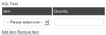 |
| Subject | Blank, Some text or Values separeted by | (if you want to display as a select list) |
Value

For certain Field Types (Select list, Radio, Checkbox, Free Text, Number, Number Range) you have to setup the available options separated by pipe | . For example, on our support contact page you have to fill which browsers you have tested, in order to do that we selected the checkbox field type and typed the following content in the value box: Firefox|Internet Explorer|Opera|Google Chrome|Safari|Other. See table above for more examples.
Tooltip

Add a tooltip to be shown when the mouse is over the field's label (frontend).
- Allows HTML tags
- Max length:250 character
Atributes

This advanced option makes Contact Enhanced even more powerfull! You can add styling and javascript code here. If you are an advanced user you can add, for example, a background-image to any field or a javascript onchange event to a selectlist;
Attibutes dummy examples:
- style="background-color:#F0F0EE;border:1px dashed #9FD377"
- onfocus="this.style.border='3px solid #9FD377'"
- onblur="this.style.border='1px dashed #9FD377'"
- onblur="if(this.value !=''){ alert(this.value);}"
Publishing Info
Published

Whether or not Users can view this Custom Field.
Category

Select the Contact Enhanced Category for this Custom Field from the drop-down list box. Note that you must have at least one Contact Enhanced Category defined before you can add a Custom Field.
Order

Indicates the order of this Custom Field when display on the website . The default Order is to add the item to the end of the list. This Custom Field will move to the position just after the Custom Field selected from the drop-down list. Note that the Order of Custom Field can also be changed in the Custom Field Manager.
Required

Indicates whether the user is required to fill this field in order to submit the form or not. Contact Enhanced uses MooTools1 to validate the forms.
Toolbar
At the top right you will see the toolbar:
The functions are:
-
Save. Save it and return to the main screen of the Manager.
-
Apply. Save it, but stay in the same screen. If you have been working on a screen for a long time and don't want to risk losing your work, pressing Apply saves your work and lets you continue working. If, for example, you lost your Internet connection, your work will be saved up this point.
-
Close. Return to the previous screen without saving your work. If you press Close while adding a new item, this new item will not be created. If you were modifying an existing item, the modifications will not be saved.
-
Help. Opens this Help Screen.
Points to Watch
At least one Contact Enhanced Category must be added before adding the first Custom Field.
1 MooTools is a compact, modular, Object-Oriented JavaScript framework designed for the intermediate to advanced JavaScript developer. It allows you to write powerful, flexible, and cross-browser code with its elegant, well documented, and coherent API. MooTools code respects strict standards and doesn't throw any warnings. It's extensively documented and has meaningful variable names: a joy to browse and a snap to understand. MooTools is compatible and fully tested with Safari 2+, Internet Explorer 6+, Firefox 2+ (and browsers based on gecko), Opera 9+. Mootools is the Joomla default Javascript Library!
{tab=Custom Values}
Custom Values
How to Access
Select Components → Contact Enhanced → Custom Values from the drop-down menu on the back-end of your Joomla! installation.
Description
The Custom Fields Manager screen allows you to create advanced Custom Fields using the SQL custom field type;
Details
Text: The text the user will see in the dropdown select list (required);
- Value: The text that you will get in the email (required);
Type: You can enter any value to help you to keep things organized;
Category: You can use this field as you wish; You can enter a value or select one from the list; IMPORTANT: This is not necessary related to the Contact Enhanced Categories;
SQL Field Examples:
- Nothing fancy:
SELECT text, value FROM #__contact_enhanced_cv WHERE category = 'MY_CATEGORY_NAME_OR_ID' ORDER BY ordering - Same content for the value and text:
SELECT text, text as value FROM #__contact_enhanced_cv WHERE category = 'MY_CATEGORY' AND TYPE='Any type' ORDER BY ordering - If you have a small SQL knowledge you can play around with it. Let's say that you need to show the part number and product name, you your SQL will be like this:
SELECT CONCAT_WS(' :: ',value, text) AS text, value FROM #__contact_enhanced_cv WHERE category = 'MY_CATEGORY_NAME_OR_ID' ORDER BY orderingSELECT CONCAT_WS(' :: ',value, text) AS text, value FROM #__contact_enhanced_cv WHERE category = 'MY_CATEGORY_NAME_OR_ID' ORDER BY ordering - Same content for the value and text:
SELECT text, text as value FROM #__contact_enhanced_cv WHERE category = 'MY_CATEGORY' AND TYPE='Any type' ORDER BY ordering - Get a backend userlist:
SELECT username AS value, name AS text FROM #__users WHERE gid >=23 ORDER BY name ASC - Get data when the user is logged in:
Get user id:
SELECT id AS value, id AS text
FROM #__users
WHERE id = {user_id}
Get user name:
SELECT username AS value, username AS text
FROM #__users
WHERE id = {user_id}
Get Product and order Info from VirtueMart: - SELECT p.product_name AS text,
CONCAT('Product:',p.product_id,' - ', p.product_name,
' :: Order ID:', o.order_id ,
' Date: ', FROM_UNIXTIME(o.cdate),
', Status: ', os.order_status_name) AS value
FROM jos_vm_orders AS o
INNER JOIN jos_vm_order_item AS oi ON o.order_id = oi.order_id
INNER JOIN jos_vm_product AS p ON p.product_id = oi.product_id
INNER JOIN jos_vm_order_status AS os ON o.order_status = os.order_status_code
WHERE o.user_id ={user_id}
{/tabs}
Copyright © 2018 IdealExtensions.com. All Rights Reserved.
We may collect your IP address and your browser's User Agent string while using our site for security reasons and deriving aggregate information (analytics). This information is retained for a minimum of 1 and a maximum of 24 months.